Overview
While working for Arbor Education I built a new design system, since the one that they had only contained a few components, none of which were accessible, responsive or adaptive.
Process
I followed my usual 6-step process, which is based on the Google Design Sprint. While the Google Design Sprints normally are undertaken over a period of 5 - 10 days (including planning), the same principles can be used for longer projects to give structure to the project development and enable agile sprint planning.
• Understand
• Define
• Sketch
• Decide
• Prototype
• Validate
• Define
• Sketch
• Decide
• Prototype
• Validate
Adapted UX process (product lifecycle)
Understand
Up until I started work at Arbor the products had been engineering-led. Years of engineers working in siloes, with little or no design experience, had resulted in a product that was inconsistent in its look and feel and there was no single-source-of-truth for the product team to refer to. As the Principal Product Designer I understood the importance of having a design system linked to the engineering component library and being able to govern output.
Define
Having experience of inclusive design I knew it was important to refer to some of the best design systems in the world for tips on how to design and build the new components for Arbor.
I referred to many renowned companies, most notably Design System by Gov.uk, GEL by the BBC and Cauldron by Deque. By cross-referencing which components we used at Arbor and which components were available through other design systems I was able to do a gap-analysis and create a roadmap for the design and build of new components and updates.
The design system would be built using Figma and would have an introduction, a set of principles and links to each page within Figma for the various sections, e.g. Inputs. In time, each component in the Figma design system would be linked to a React component in the engineering library.
I worked closely with the engineering manager to allocate resources to complete the roadmap in an agreed timeframe. We planned to update around 1 or 2 components per sprint (two weeks).
Sketch
Since I'm proficient in the use of Figma, I rarely needed to sketch any designs for this project, other than to get my own rough ideas onto paper and share with colleagues for initial feedback on more complex features which used a combination of components.
Decide
Each week I would present my designs at a peer review, wherever possible showing an old component and the newly updated component for feedback. Often I would showcase different versions of the same workflow to get initial feedback and insights from my peers. I would design a 'safe' version, an 'adventurous' version and a 'wild' version.
My peers included members of the product and engineering teams. If a component was signed-off as ready for production then I would collaborate with the marketing team to ensure that the training and support materials were updated with screen grabs of the most recent component so that manuals etc. were kept up-to-date.
Mega nav concept - version 01.0 (safe)
Mega nav concept - version 02.0 (adventurous)
Prototype
To assist the engineering team with building the updated/new components, wherever necessary I would create a simple prototype and either make a video recording of me using the prototype for them to refer to, or I would annotate my static designs in a separate document explaining my design decisions and how to code for better accessibility.
Mega nav concept - version 03.0 (wild)
Validate
Whenever a new or updated component was made live, I made sure that the QA team had tested the component first and Product Managers kept a watchful eye on customer comments on Productboard and on social channels. Support teams were also made aware of the changes so that bugs could be picked up quickly. We had a Slack channel dedicated to reporting bugs so that we could all collaborate on fixes.
Key Features
Onboarding
I created an onboarding document for colleagues to refer to which explained the concept of Juicebox (the name of the design system) and how to use the Figma design system. There were links to each of the pages in Figma to make it quicker and easier for colleagues to find what they were looking for.
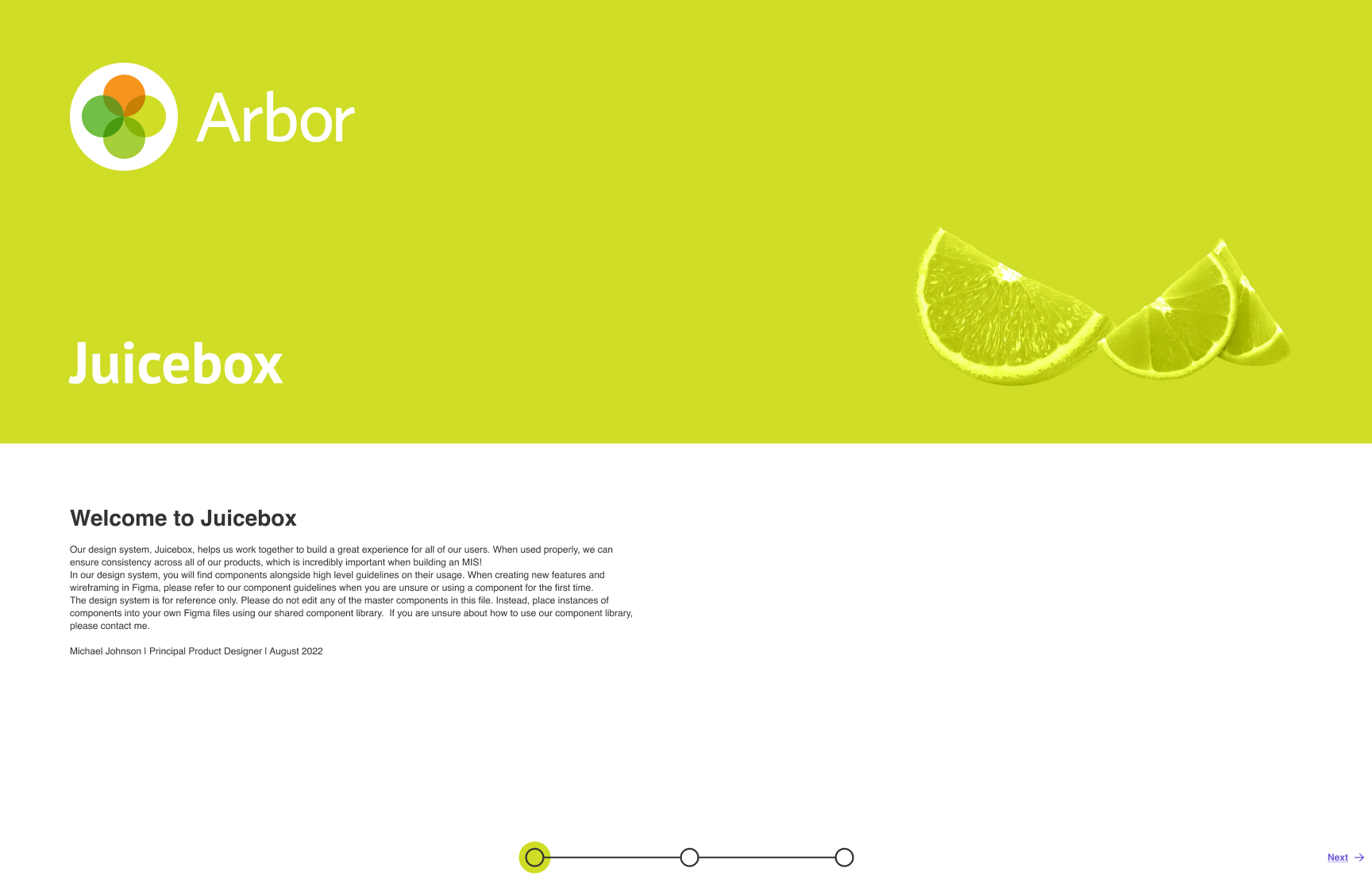
Welcome to Juicebox 1/3

Inclusive Design Principles 2/3

Component Libraries 3/3
Intuitive page hierarchy
I structured the content of the design system so that it would be as simple as possible for colleagues to find what they were looking for. I used icons for some pages to represent groups of components that might be used outside of the product (such as in UX documentation) and I created a page for sandboxing ideas for component consideration. All live component pages were in alphabetical order.
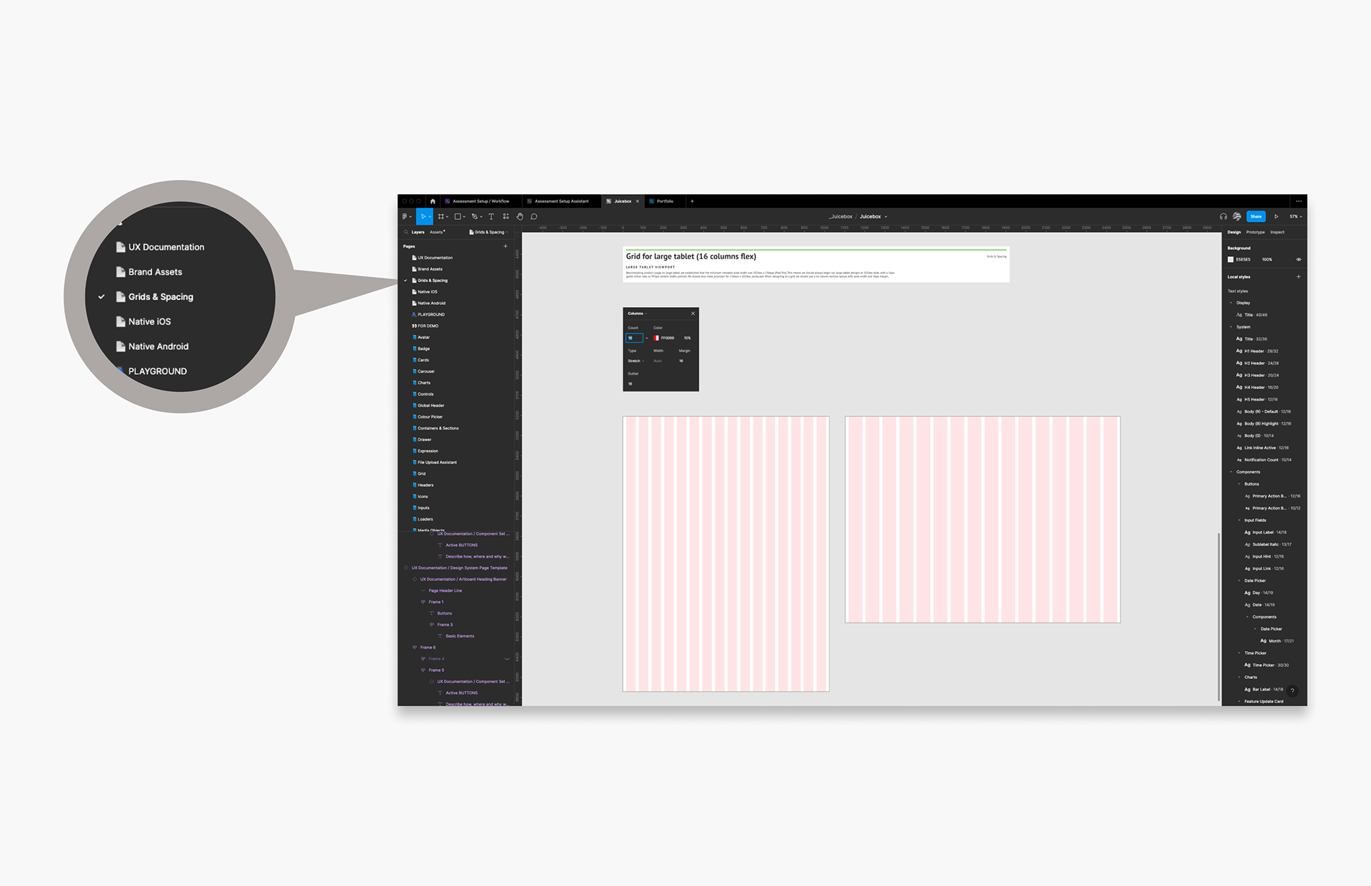
Icons to represent non-component elements of the design system
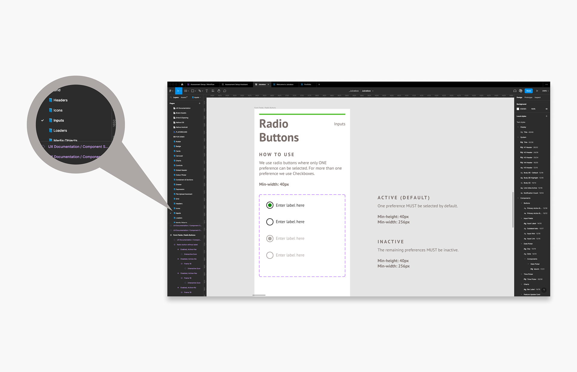
Component elements of the design system in alphabetical order
Grids & Spacing
The product had not been built to a grid system and was not responsive. As part of my strategy to bring the product up-to-date I gave a presentation on how and why we should design to a grid system and then I reinforced the concept by including instructions in the design system explaining the same.

Grid for phone
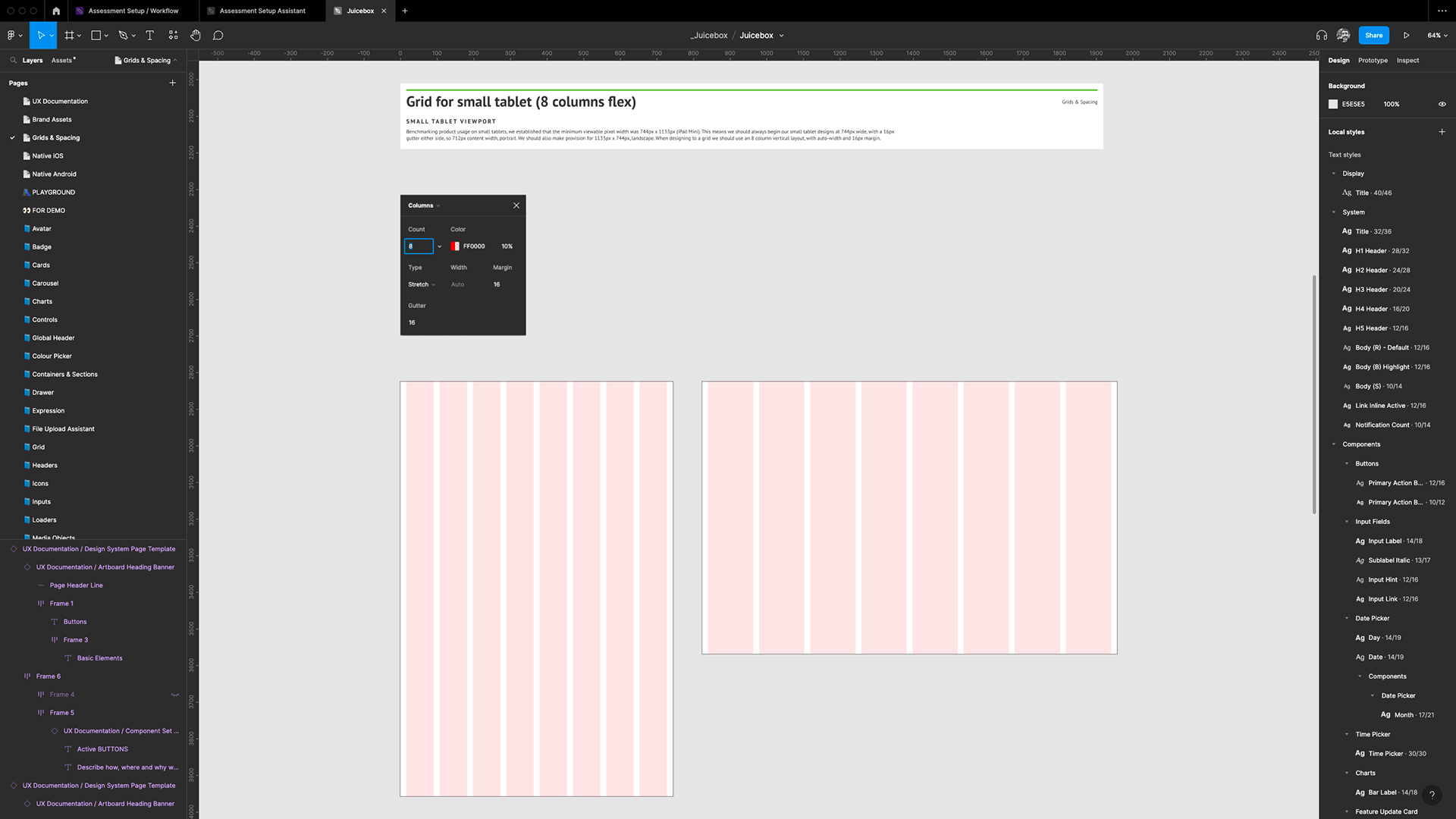
Grid for small tablet
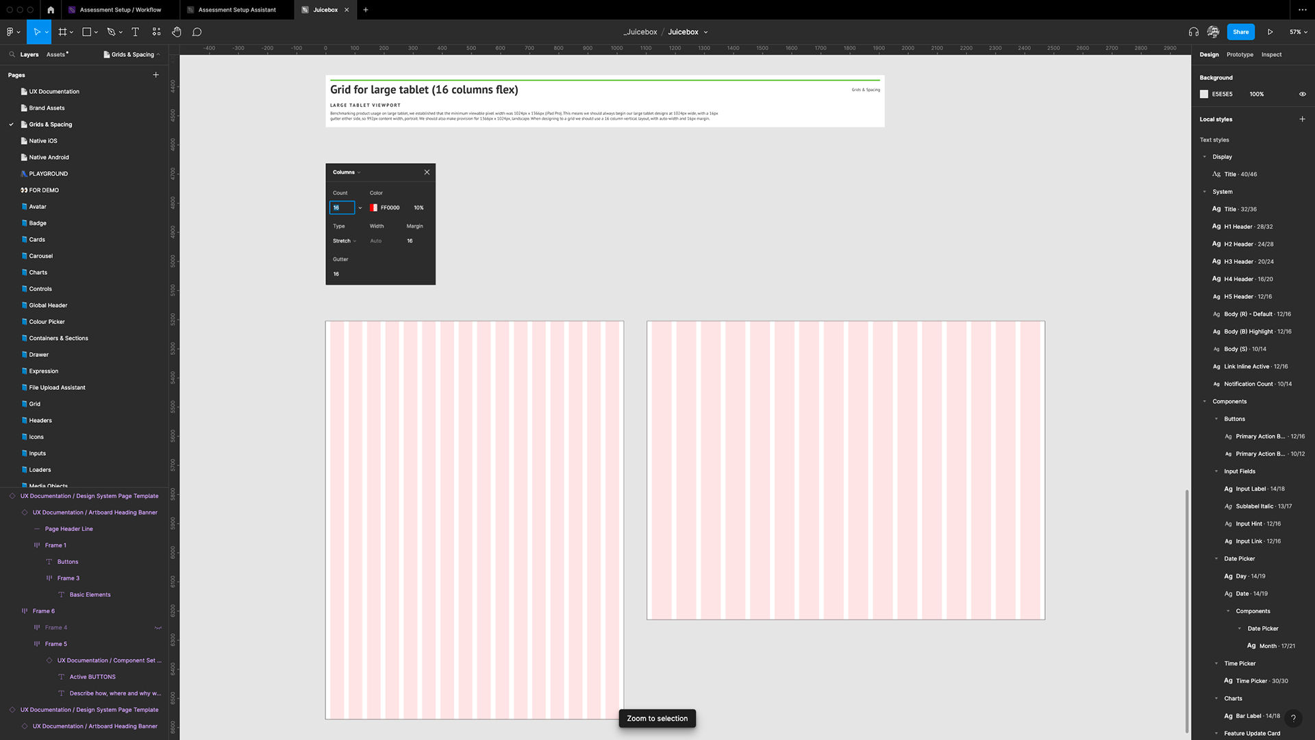
Grid for large tablet
Colour & Contrast
I worked closely with the marketing team to decide which of the marketing colours we use within the product, to make all digital content feel like it is from the same family. I set up style definitions for colours within the design system and included colour swatches on a Brand Assets page. I used Coolors.co colour wheel to find new colours that complemented those we decided to keep. I also checked all colours for contrast so that we could ensure that components such as buttons would be accessible at minimum font sizes and weights.
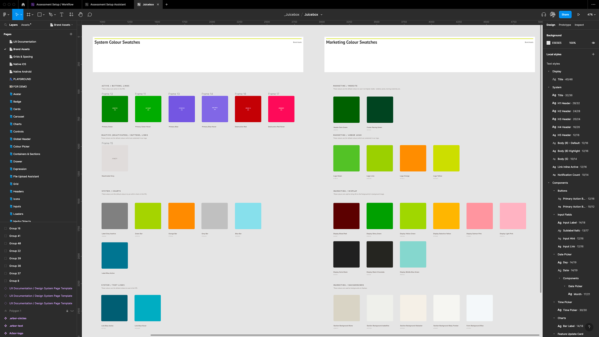
Colour swatches
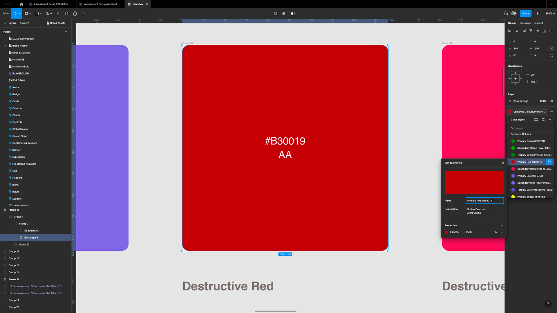
Style definitions
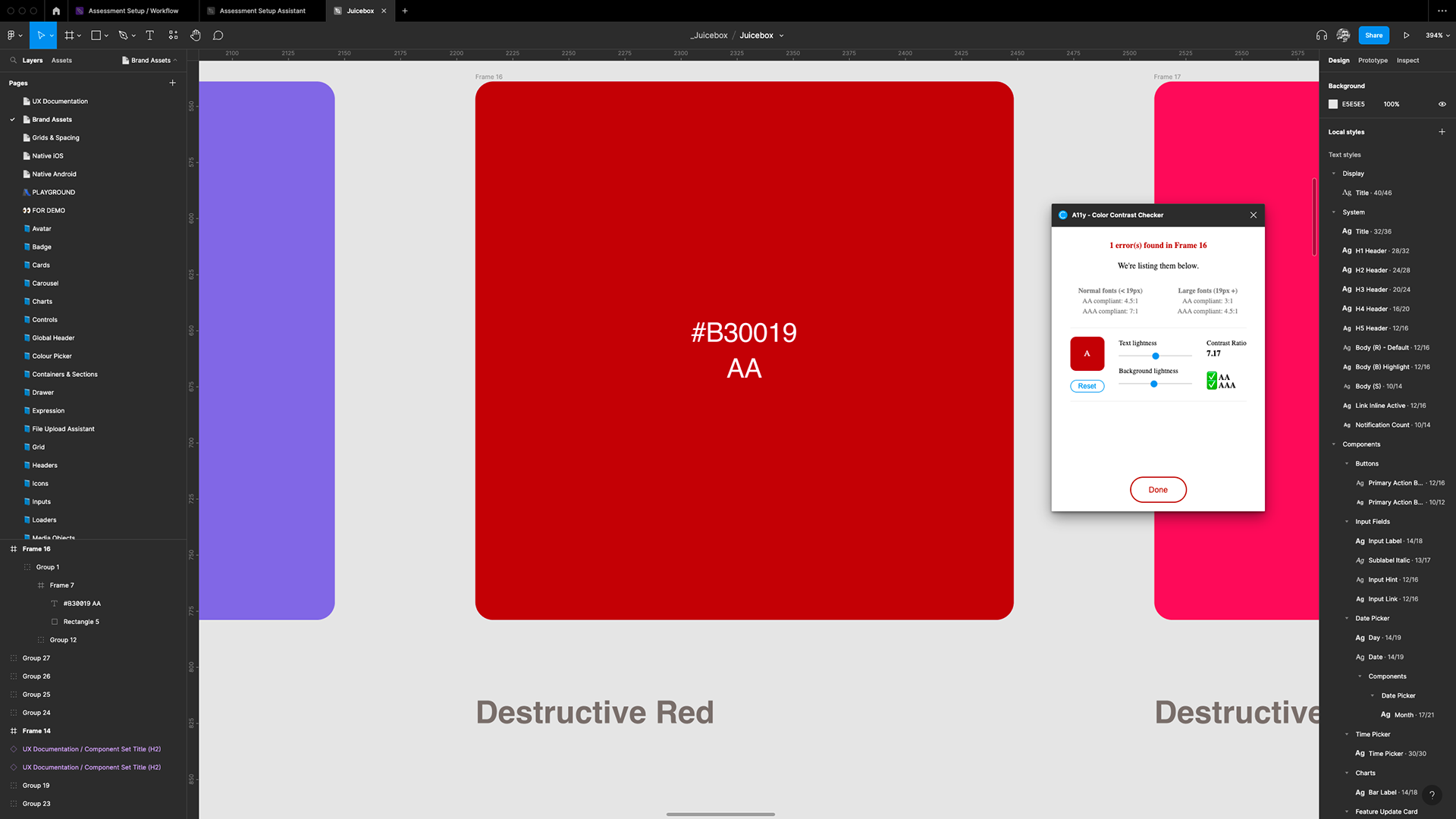
Accessibility colour/contrast checker
Key Results
A framework for design consistency
The new design system was a framework for better design consistency within the product. It provided all of the components, pre-validated for accessibility requirements, that would be needed for any existing roadmap projects. Of course, like any design system it is a living organism and will change over time, but without a simple single-source-of-truth the product would have been unable to improve either functionally or aesthetically.
A testing tool for user researchers
The new design system was more than just a toolbox for a future design team, it was used by colleagues who could easily drag and drop a variety of pre-validated components into frames in Figma to create mockups which they could use to quickly test ideas with users when a fully functional prototype wasn't required.
A formal process for component iterations
I created a Slack channel called #ux_product_design_system where colleagues could post links to their new/updated components in their own Figma files, or link to the sandbox in the design system, so that they could be reviewed. If it was decided that the component should be included in the design system then it would be added, else it would be tagged as bespoke (not to be reused) in both the design system library file and the accompanying engineering component library.

New or updated component/feature request (part 1)
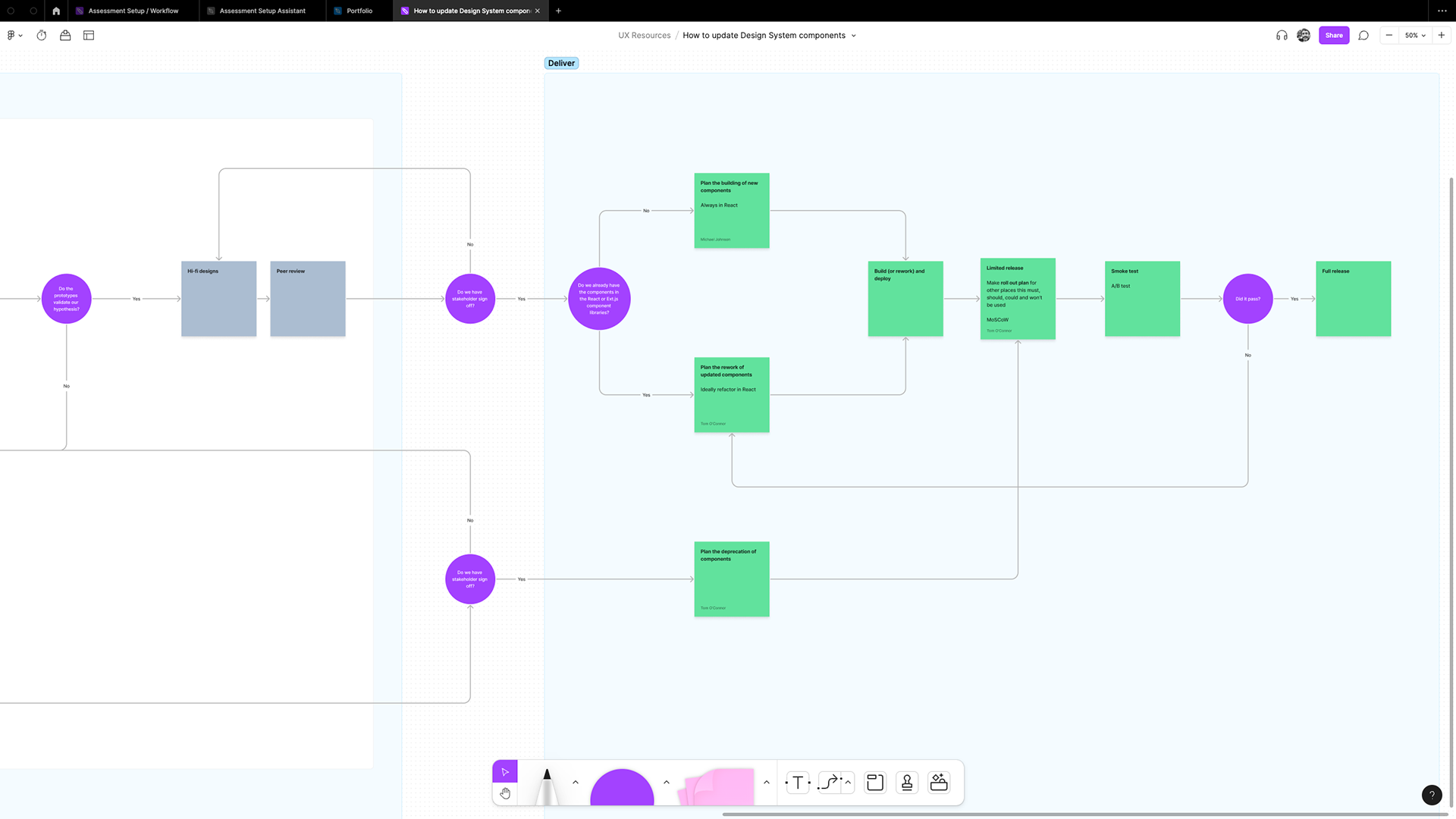
New or updated component/feature request (part 2)
An efficient product design awareness programme
I recorded videos each time I updated the design system to explain to colleagues how and where to use the updated components and explained why I had made particular design decisions. This saved me a lot of time as there was no need to individually up-skill the team.
Improved collaboration between teams
The new design system encouraged collaboration between the marketing team and product team and each had a new found respect for the amount of work that goes into making even a seemingly simple change to aesthetics within a product. Training materials, sales materials and support materials all need to be updated when a component changes, if they contain any screenshots of the product. It also encouraged collaboration between the engineering team and myself, as Principal Product Designer, since we needed to consider each other and respect each others resources in order to plan and deliver the roadmap for component updates.