The Situation
The team
I was the only UX designer in the Monetisation squad, accompanied by a media partnership manager, a product manager, a visual designer, a researcher, three developers and a digital analyst. We needed to be a highly collaborative team.
The challenge & forecast outcome
Asda has a partnership with an agency to sell advertising space on the Asda website and apps to suppliers. As part of that partnership in 2021 it was agreed that Asda would deliver a feature that would strengthen their proposition by enabling the agency to sell more ad impressions than usual. The feature was forecast to deliver an annual increase in revenue of £1m.
The project sizing guide
Before we began the project we estimated how long it would take to deliver for our annual roadmap, so that our Programme Manager could make provision for it on the sprint plan when the project was about to start. To do this we referred to our in-house Project Sizing Guide and since it was a new feature and we did not know what we were going to do or how we were going to do it, we estimated 12 weeks.
The Tasks
Adopt an 'agile' and 'lean' approach
When it was time to begin the project we referred to our Product Lifecycle, which focuses on accessibility and usability considerations at the beginning of the product lifecycle and relies on testing and iterating throughout the development process, in effect, baking those requirements into the definition of 'done'.
Working in this manner reduces the time, effort and cost involved in delivering a fully accessible and usable product to market, when compared to remediating at a later date. The twelve-step process is cyclical and highlights where UX involvement is essential. It's important when translating these steps into a project management tool such as Jira, that testing at each stage is a 'dependency' of the project, which can't go-live without them being completed and the product verified as working correctly.
Understand the problem
To start we needed to fully understand the user problem. We had some high-level workshops with all of the project collaborators to "go wide" with our understanding, to make sure that we wouldn't just run with a potential solution without considering all options
After these workshops we were able to focus on just the things that we agreed were important and come up with a problem statement:
"When searching for an item on the Asda Groceries website, the customer must be presented with a results list, which also contains some sponsored content which is inspiring, eye-catching and engaging and will encourage the customer to shop new or alternative items, improving the customer experience while increasing revenue for Asda."
Establish and agree designs constraints
We must use real estate only on the search results page.
We must occupy a space no taller than the height of a product module.
We must not take the user out of their journey.
We must be mindful of the risks of deploying the new feature and unintentionally having a negative impact on overall trolley-adds and trolley-value.
Ideate
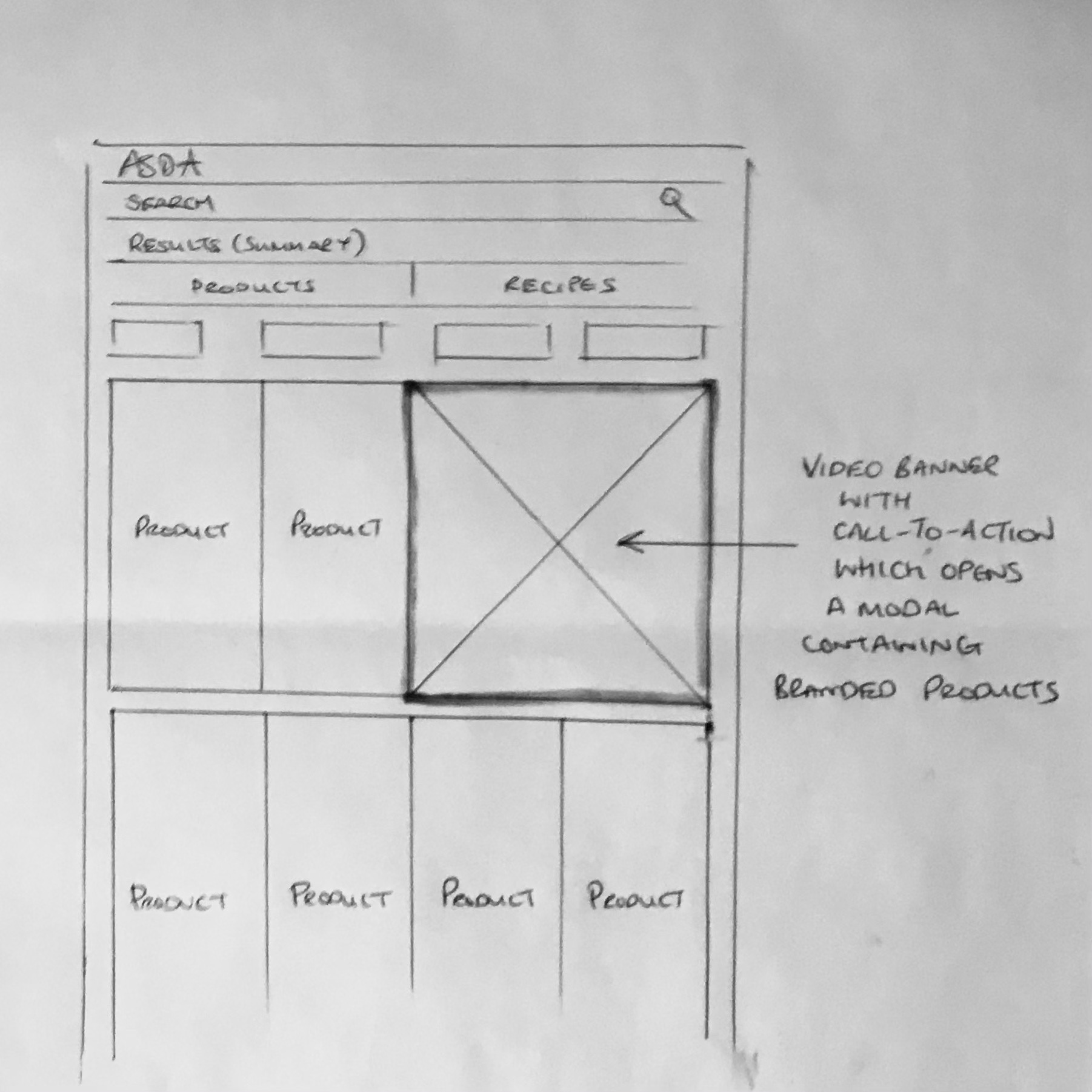
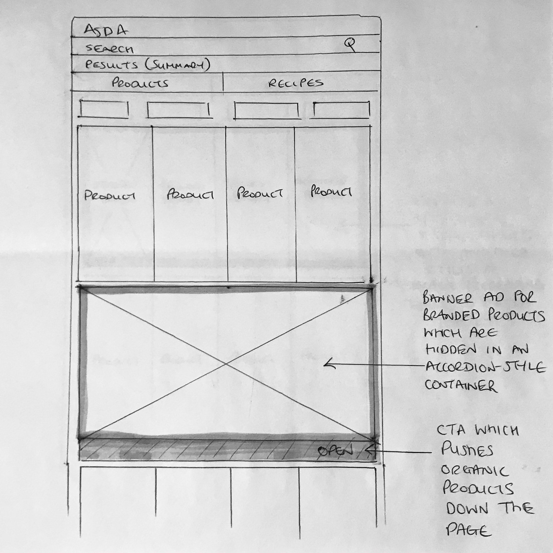
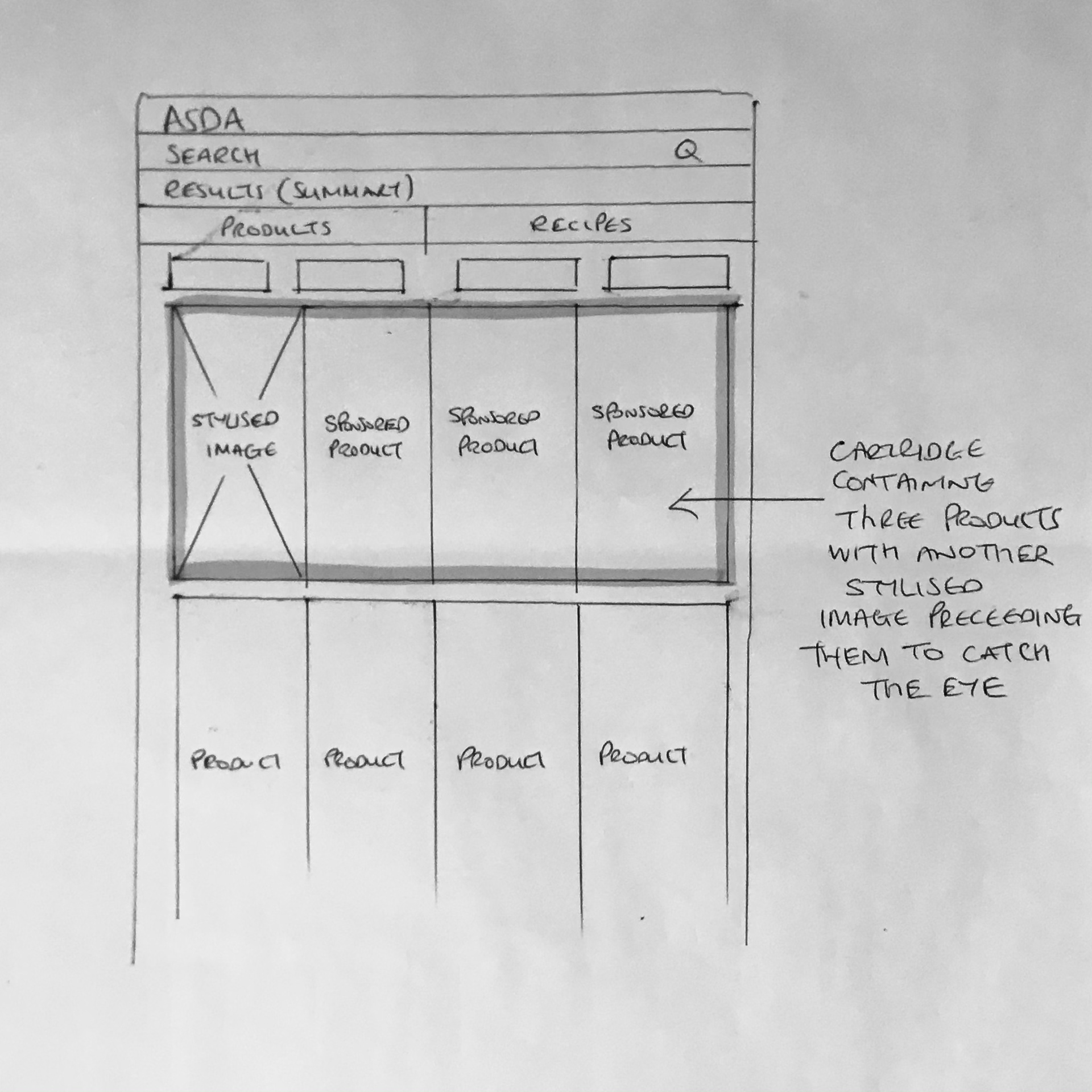
Through a series of workshops with colleagues led by the Monetisation squad we thought of a number of possible solutions. We considered ad banners - dynamic banners and animated banners - and we considered dynamic product placement.
Prototype and user test
Our UX researcher took our ideas to our customers and through an external recruiter was able to get candidates for research based on criteria provided by our personas and our accessibility requirements for at least four candidates with different disabilities and assistive technology needs.
Through a series of questions we were able to get a sense of what people liked best and we were able to use this information to inform our decision on which concept to develop.
Build the right solution
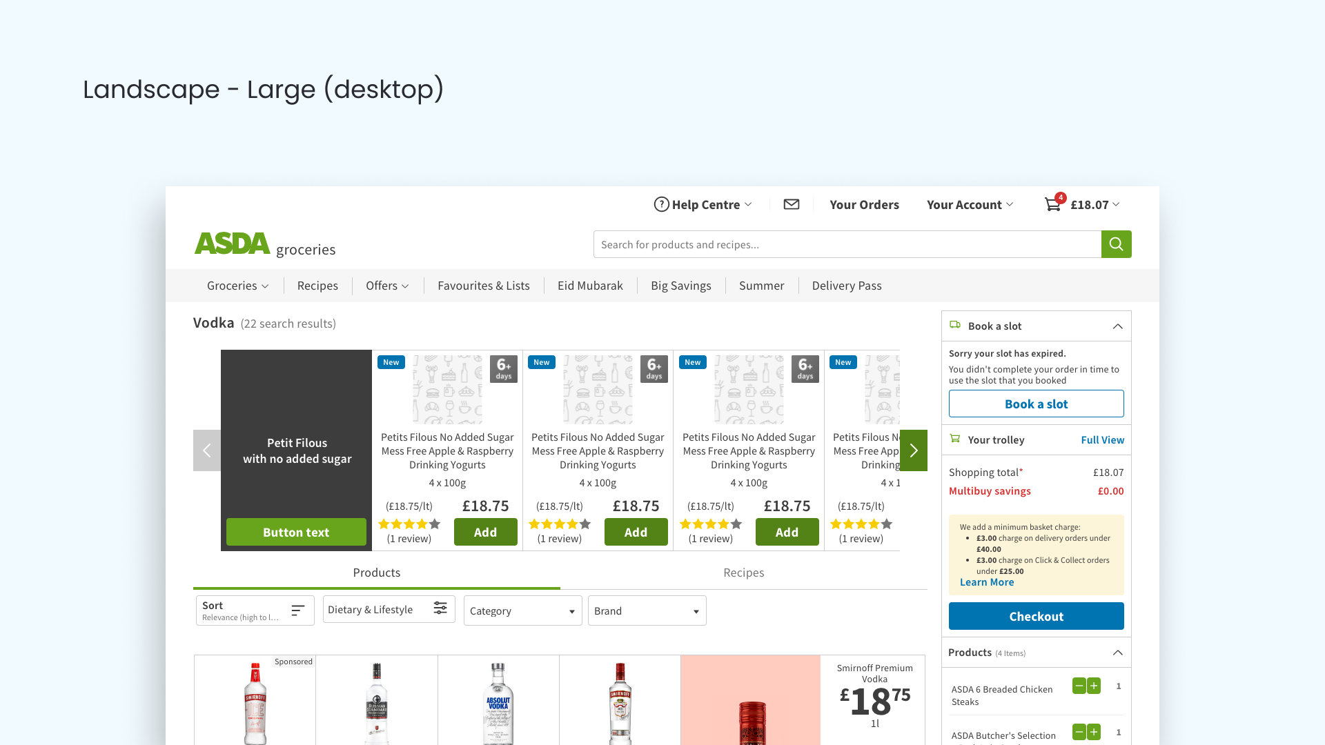
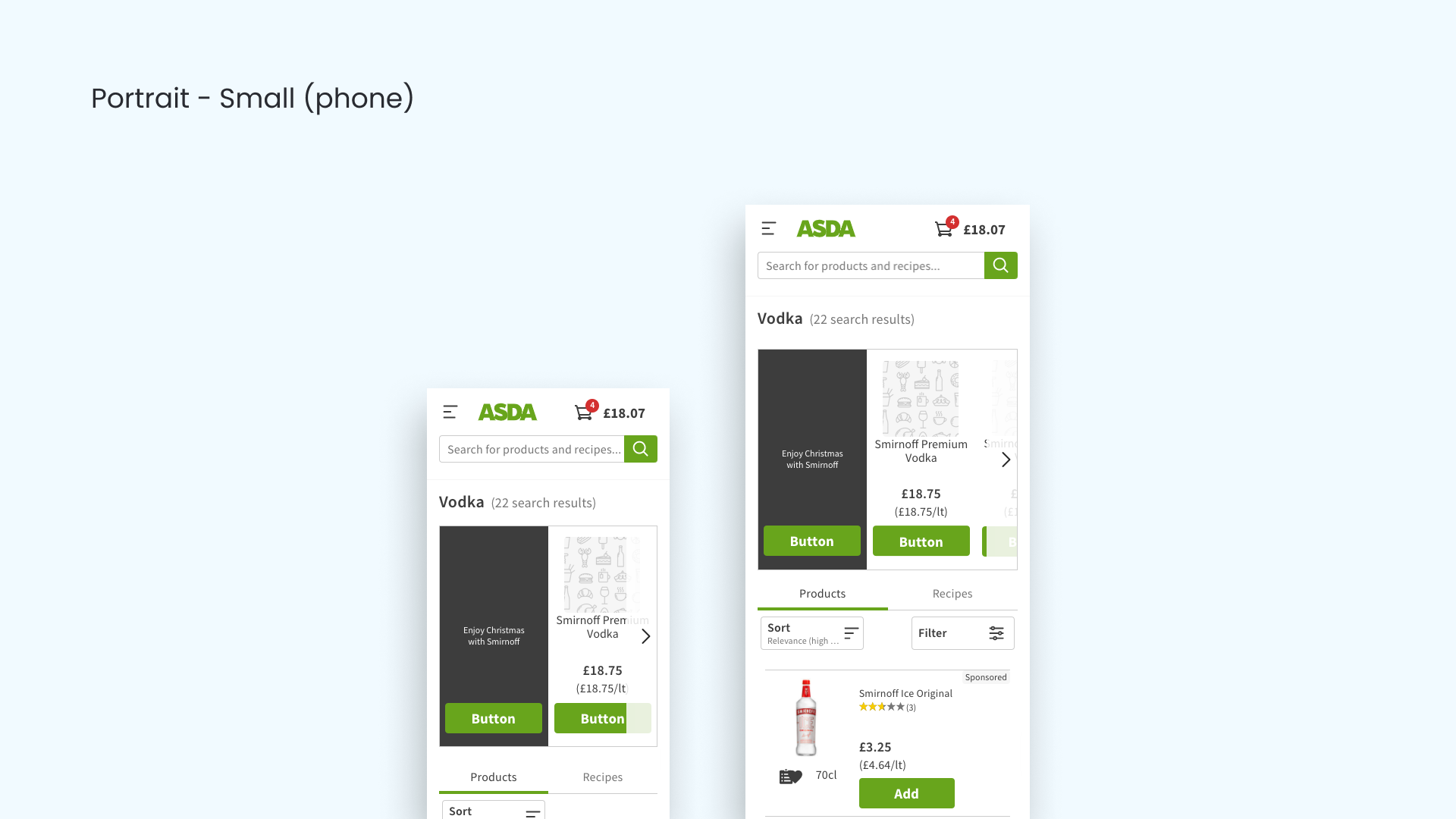
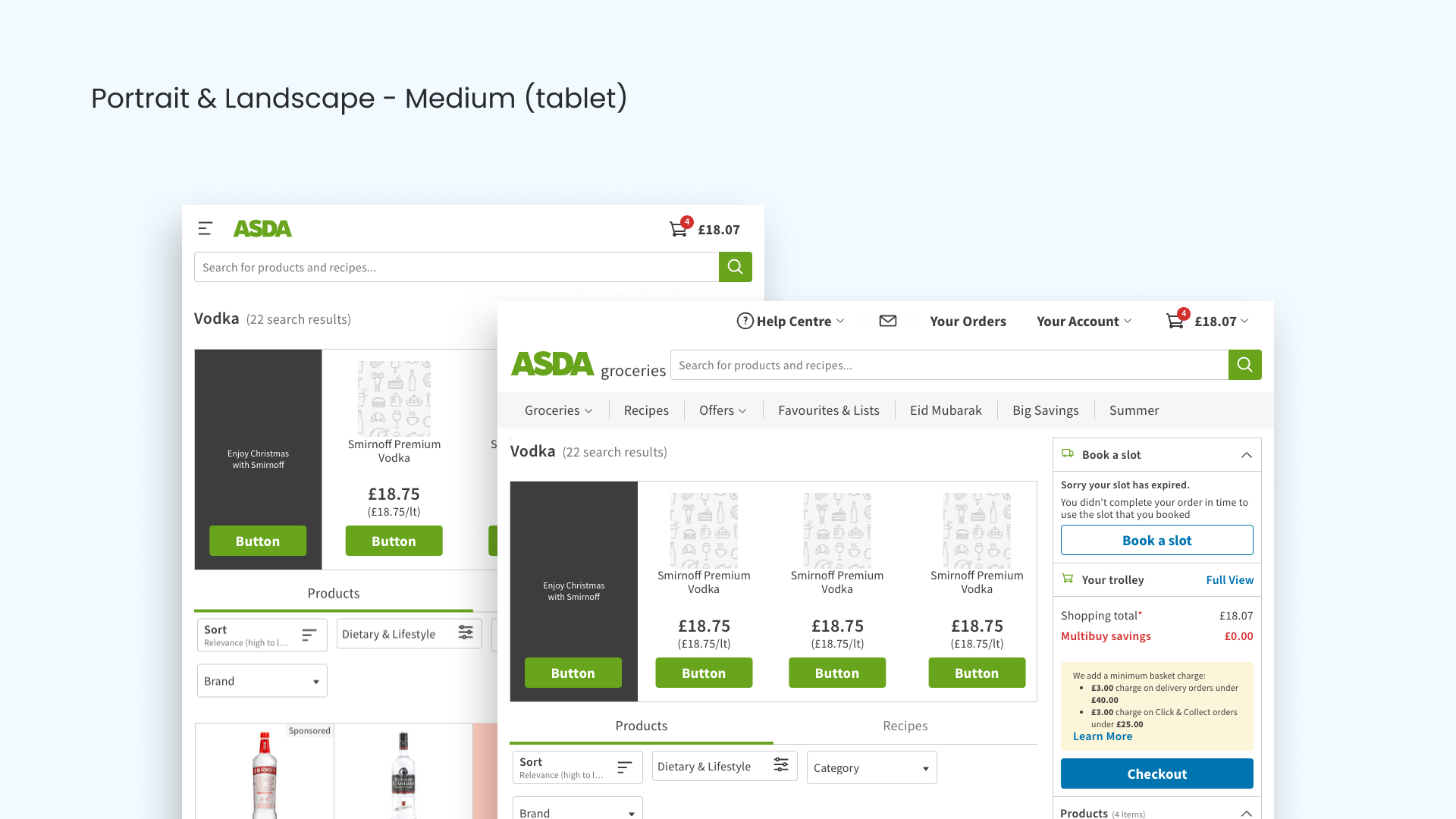
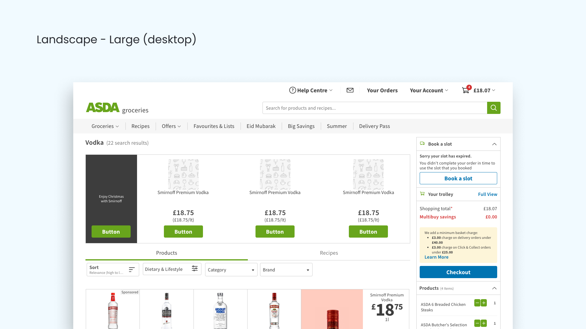
The winning concept was to have a full-width module at the top of the search results page, which would contain a branded banner with a button to "Shop all", plus 2 or 3 product modules containing sample products from that brand, which customers could easily add to their trolley without leaving the existing journey.
The hypothesis
Suppliers would most likely like it because it places their brand at the top of the search results page, it is eye-catching, has a button to take customers to a completely branded page and presents a number of their products for sale without the need for leaving the existing journey. We presented the concept to stakeholders at Asda and the agency and it was well received.
The measure of success
We decided upon using a combination of qualitative and quantitative research, which would include the results of moderated and unmoderated user research and some digital analytics. The digital analytics would focus on the number of ad impressions, the number of trolley-adds, the trolley-value and the overall revenue received from ad impressions over several periods of time: a week, two weeks, and a month. From this we would be able to confidently predict the likely annual revenue.
We also decided that we would initially design and develop the web app only and focus on the native app design and development later.
Design
As the UX designer I needed to demonstrate that I had considered the 8 key elements of inclusive design when designing the minimum viable product (MVP). I always follow a mobile-first and accessibility-first approach.
I have a simple rule that I try to adhere to when designing: Don't design for a persona, design for the person who needs the most help to achieve the most difficult task and in doing so you will meet the needs and exceed expectations of everyone else.
Document the DOM order
80% of accessibility issues are due to the hierarchy of information not being considered and elements not being labelled correctly. To help prevent accessibility bugs I begin every design with a "Verbal Journey", which is a document which provides everyone on the project with an understanding of what each element within the component does, where it sits in the accessibility tree and how a screen reader should announce it (or not, as the case may be). Components (and pages) must follow a logical reading order.
This document can be referred to by developers and testers, to ensure that the component is coded properly. Sections and headings, page titles, tables and lists also have to be referred to in this document if they exist.
Wireframes
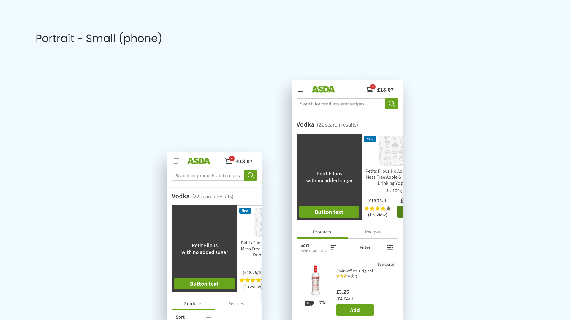
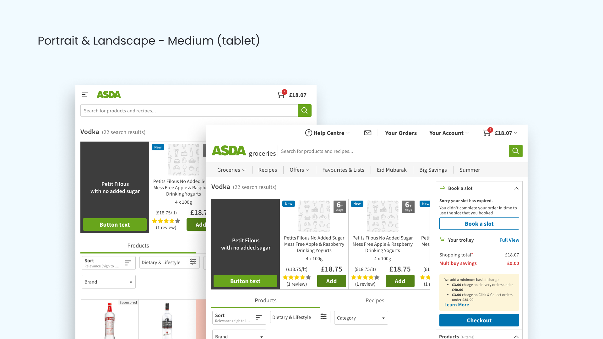
I mocked up some wireframes to give stakeholders an idea of what the UI might look like on various devices. I designed for the narrowest viewport first, which was 320 viewable pixels on an iPhone SE device. Once we'd done some refinements I moved onto the completed designs.
Build a prototype
I built a prototype using InVision, sending my designs from Sketch up to InVision using the Craft plugin. We used the prototype to demonstrate the feature to stakeholders and for moderated user research.
Moderated user-tests
Similar to before, our UX researcher took our ideas to our customers and through an external recruiter was able to get candidates for research based on criteria provided by our personas and our accessibility requirements for at least four candidates with different disabilities and assistive technology needs.
Because the prototype was limited in functionality, some of the planned accessibility features such as screen reader announcements, were presented to the candidates verbally so that we could use their feedback to tailor the experience to actual users, rather than just guessing what they would actually want.
Through a series of tasks and collating answers to a set of carefully crafted questions, we were able to get a sense of what people liked about the prototype, what the pain points were and how we could improve on the MVP.
Completed designs
I used existing components from the Asda design system for the MVP, but made a note to improve accessibility on the scrolling buttons in Phase 2 as they are difficult to see. I left white space between the product description and the price as there is a container in that space which contains a "was price" and a promo badge if a product is reduced in price.
During the process I had to make accessibility considerations for hierarchy and order, keyboard navigation and screen reader announcements, dynamic elements, touch targets, colour and contrast and images. Sadly, the Asda website is not built to support dynamic type or dark mode, else they would also have been considerations.
Engineer handover
The engineers were able to use a combination of notes which I'd included in my handover and the annotations which I'd done on the designs in Zeplin, to code the feature properly and to ensure that the behaviour was correct when using a keyboard and screen reader as well as a mouse.
MVP validation
Using a combination of UX team members, product managers, developers and in-house testers we were able to confidently validate the MVP. We were all able to use the documentation that I handed over to the developers with my designs as reference to how the component should behave when interacting with it. The product met the requirements of the 8 key elements of inclusive design. We demonstrated the MVP to stakeholders at Asda and the agency and it was well received.
Moderated user-tests
Similar to before, our UX researcher held some moderated tests with a carefully selected group of candidates, many of which had assistive technology needs. Since there seemed to be no blockers to shopping we were able to move onto the next stage of the product lifecycle, the "soft launch".
The Results
Benchmarking during a 'part launch'
For the initial launch we restricted the audience to 5% of our customer base, so that if we noticed any unusual change in customer behaviour or an unexpected negative impact on trolley-adds or trolley-value then we would be limiting the impact. We decided that the full launch would take place after analysing the data from an A/B test where we would be using the existing search results page as the benchmark and making a decision as to whether or not to proceed.
Measuring success using analytics during 'full launch'
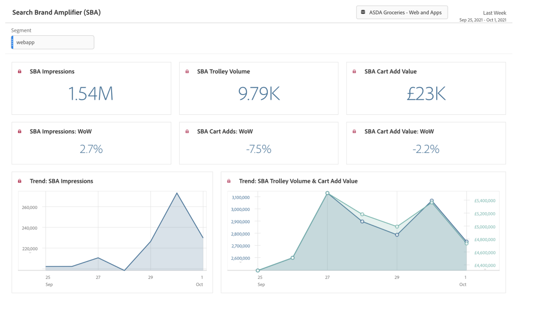
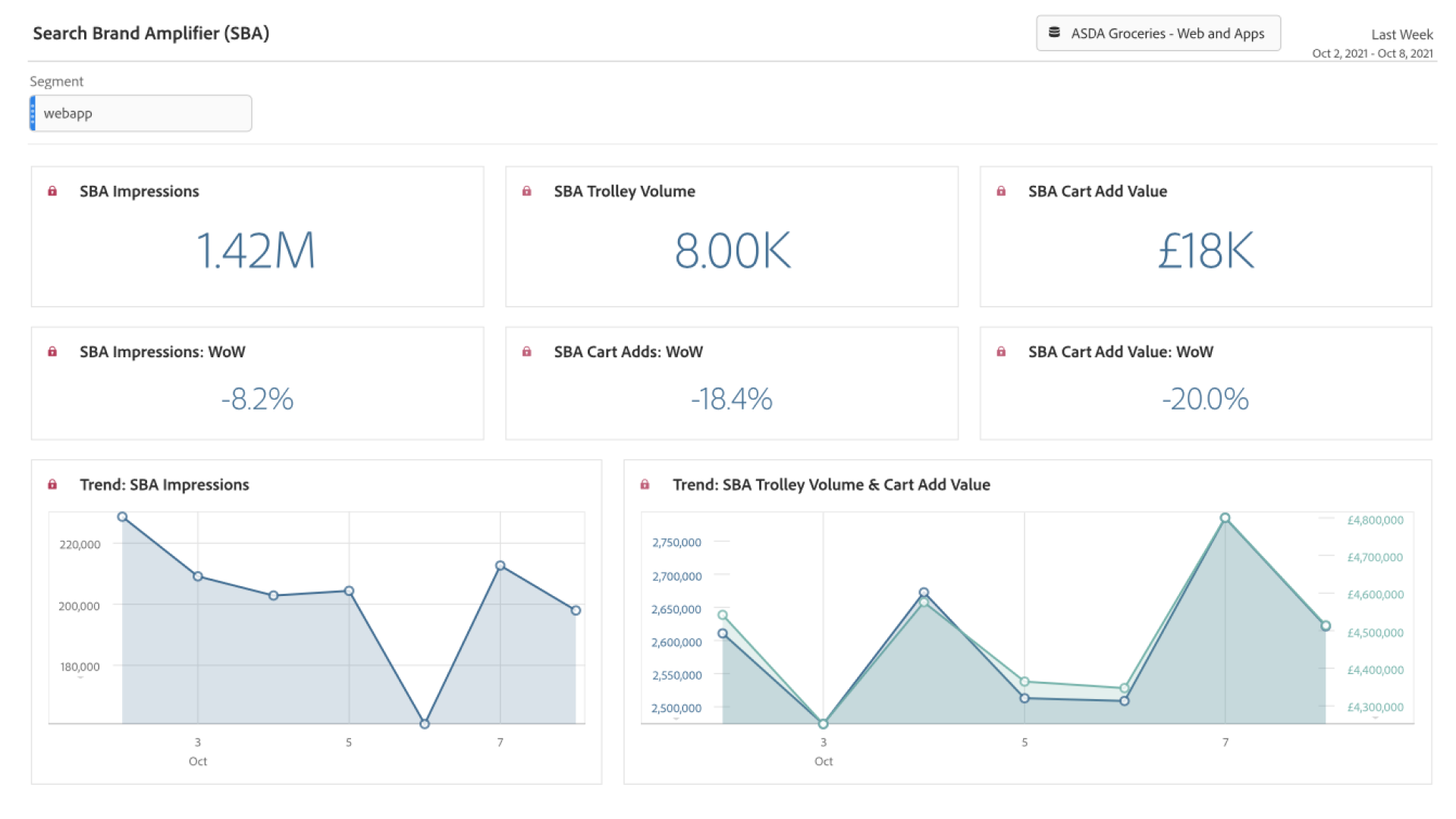
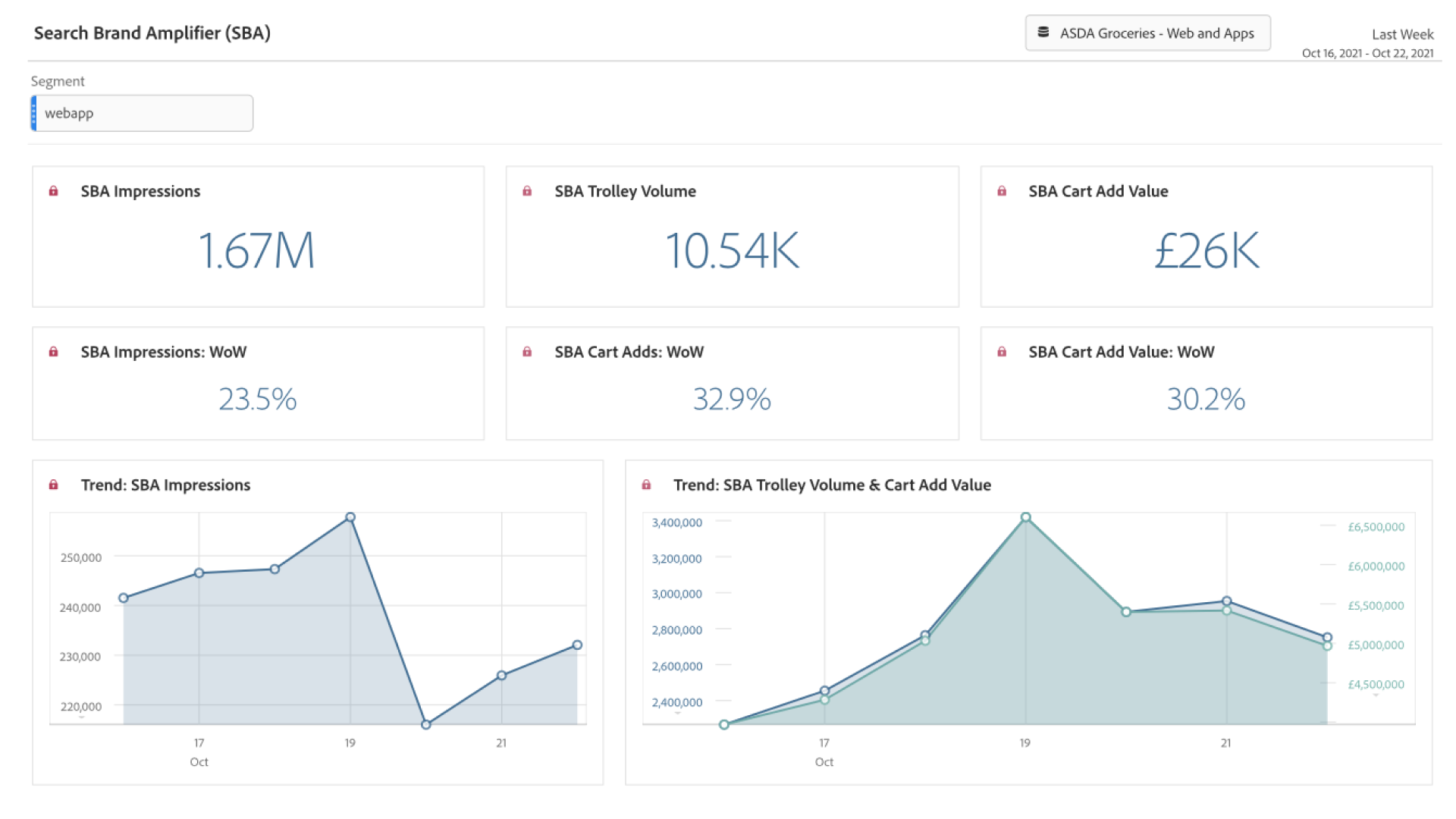
Initial quantitative data was very encouraging, showing 9.79K products added to the trolley through the Search Brand Amplifier, generating £23K in the first week. This decreased slightly in the second week to 8K products and £18K but by the end of the month revenue generated was up 30.2% week-on-week, generating £26K. We were able to take this figure and forecast an annual revenue of around £1.35M. We also didn't see a significant change in trolley-adds or trolley value which suggested that most customers were perhaps choosing amplified brands over their usual brands and some customers were adding amplified brands in addition to their usual shop - something that we had anticipated from our unmoderated research.
Overall success
The Search Brand Amplifier was launched in September and had taken 10 weeks to deliver. It was a great success, exceeding the forecasted value of £1M per year by 35%. It met all of the objectives and was built within the scope of limitations, on time and to-budget. Most importantly, it did not impact negatively on the user journey and some might say that it may have improved the user experience by introducing customers to new brands which they may not have previously considered buying - this hypothesis has yet to be validated by user research.
Next steps
Phase 1.1 of the project is to use the web app designs as a template and to rework them for the iOS and Android native apps, which is scheduled for Q1 of 2022.
Phase 2.0 of the project is to iterate on the Phase 1.0 designs, improve the UX and the Asda proposition by enabling the supplier to display more than 3 products and to tell the customer more about them, without disrupting their journey. There are several ways in which we can do this and we are already at the Design stage of the Inclusive Design Product Lifecycle process. Other improvements include removing the scrolling buttons, making the stylised banner more prominent and making the product modules larger to contain more information.
