The 4 principles of inclusive design
Perceivable
"Ask yourself: Is there anything about our product that a disabled person e.g. a blind, deaf or cognitively-challenged person, would not be able to perceive as well as a fully able user?"
Starting at the most basic level, users must be able to process information. Information that is not presented in a simple manner is not accessible. This means providing text for those who cannot hear and audio for those who can't see. It doesn't mean creating audio for all text, but content must be understood and announced correctly by screen readers. Products that require sight or hearing aren't perceivable.
Operable
"Ask yourself: Can all functions of our website be performed with a keyboard? Can users control the interactive elements of our website? Does our product make completing tasks easy? Can mistakes be easily undone?"
People with disabilities need to be able to operate products using a variety of tools. Many users with disabilities can't operate a mouse so products must be operable using alternatives such as keyboards and other touch devices. To help users with cognitive disabilities operate a website, animations and media should be controllable and time limits for completing an action should be generous or configurable - the user should have the option to pause or restart where they aren't compromising privacy or security. Most importantly, products must be forgiving. All people, not just those with disabilities, make mistakes. Offer second chances, instructions, cancellation options, and warnings to help all users.
Understandable
"Ask yourself: Is all of the text associated with our product simply written? Are all of the interactions easy to understand? Will the user understand the consequence of performing an action and understand why they have been offered a choice?"
Just because users can perceive and operate a product, that doesn’t necessarily mean that they understand it. Understandable products use clear, concise language and offer functionality that is easy to comprehend. If a user takes an action, the connection between the action and the result should be obvious. Navigation should be used consistently across a products, regardless of platform or device. Forms should follow a logical flow and provide clear labels. If a user must go through a process e.g. checkout, then adequate guidance should be provided. If this feels like usability and not accessibility, that’s because usable websites are inherently more accessible.
Robust
"Ask yourself: Does our product work with different operating systems, browsers, touch devices, non-touch devices, in portrait and landscape at different viewport widths?"
Users pick their own mix of technologies. Within limits, products should work well-enough across platforms, browsers and devices to account for personal choice and user needs. While users shouldn't expect a product to work with legacy software more than five years old, products shouldn't dictate the technology users can use. When products dictate technology platforms they restrict access for any non-conforming user. One of the best ways to meet the principle of robustness is to follow development standards and conventions. Clean code is generally more robust and consumable across platforms.
Project execution
Overview
I was asked to evaluate two different product modules from the Asda website - one portrait and one landscape - and improve them by making them more usable.
The 8 key elements of inclusive design
I always begin a project with the 4 principles of inclusive design as my considerations. I then expand on that to include considerations for the 8 key elements of inclusive design where applicable. Those elements are:
• Hierarchy and order;
• Navigation;
• Animations and dynamic elements;
• Links and button touch targets;
• Use of colour and contrast;
• Images;
• Magnification and responsive design;
• Forms
• Navigation;
• Animations and dynamic elements;
• Links and button touch targets;
• Use of colour and contrast;
• Images;
• Magnification and responsive design;
• Forms
User research & the element list
I noticed that the hierarchy of information was different between the two example product modules. This is bad practice since we should be consistent so that users are able to easily navigate whenever they arrive at a module, regardless of where they are in their journey.
On this occasion I didn't have the time or resources to conduct moderated or unmoderated user research and so instead I arranged a card-sorting exercise with colleagues to decide upon a single more logical order. The new order would remain the same regardless of the component dimensions and whether it was in portrait or landscape.
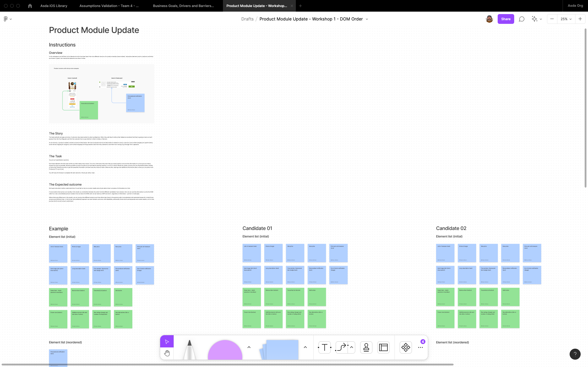
Workshop overview in Figjam
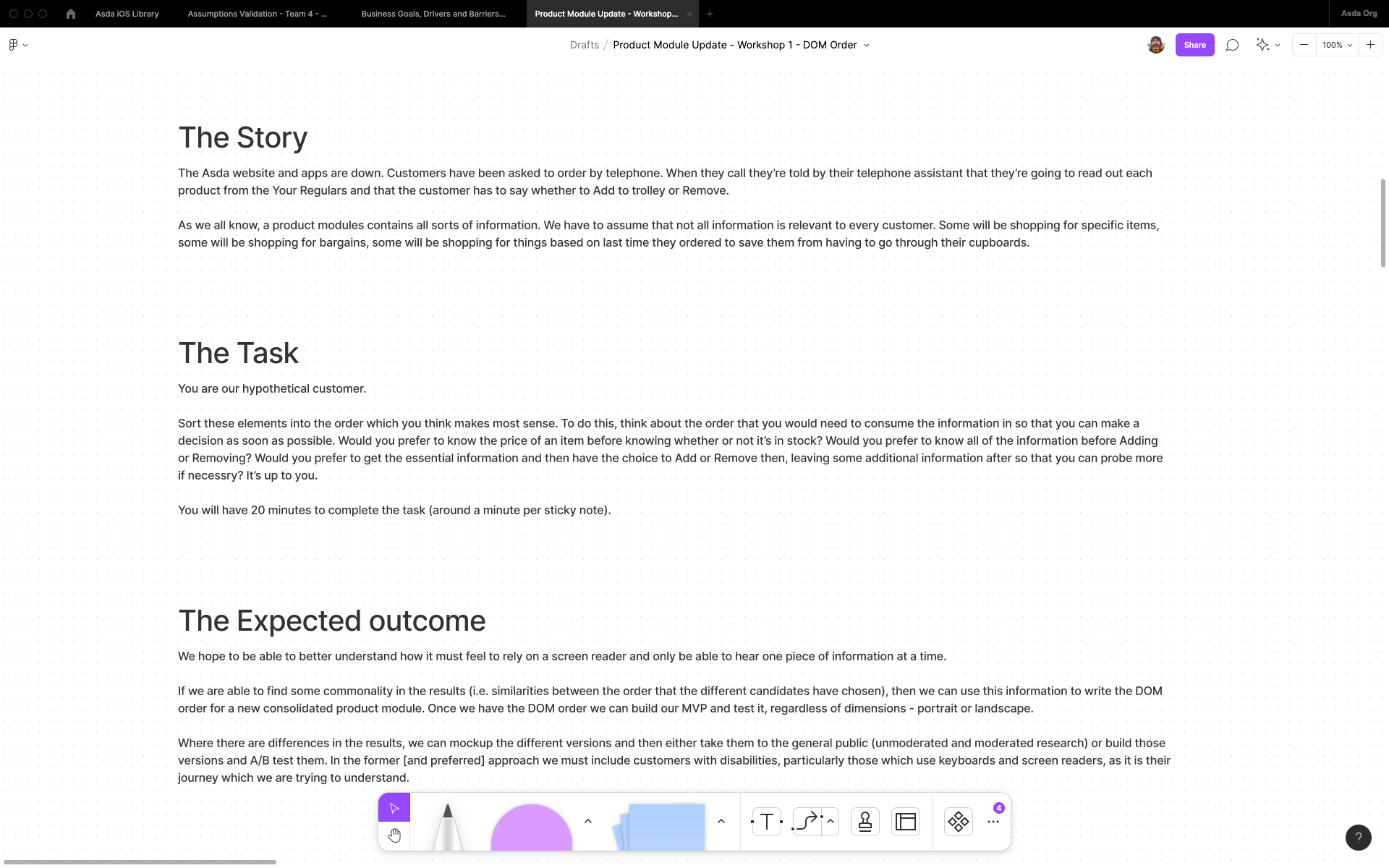
Workshop story, task and expected outcome in Figjam
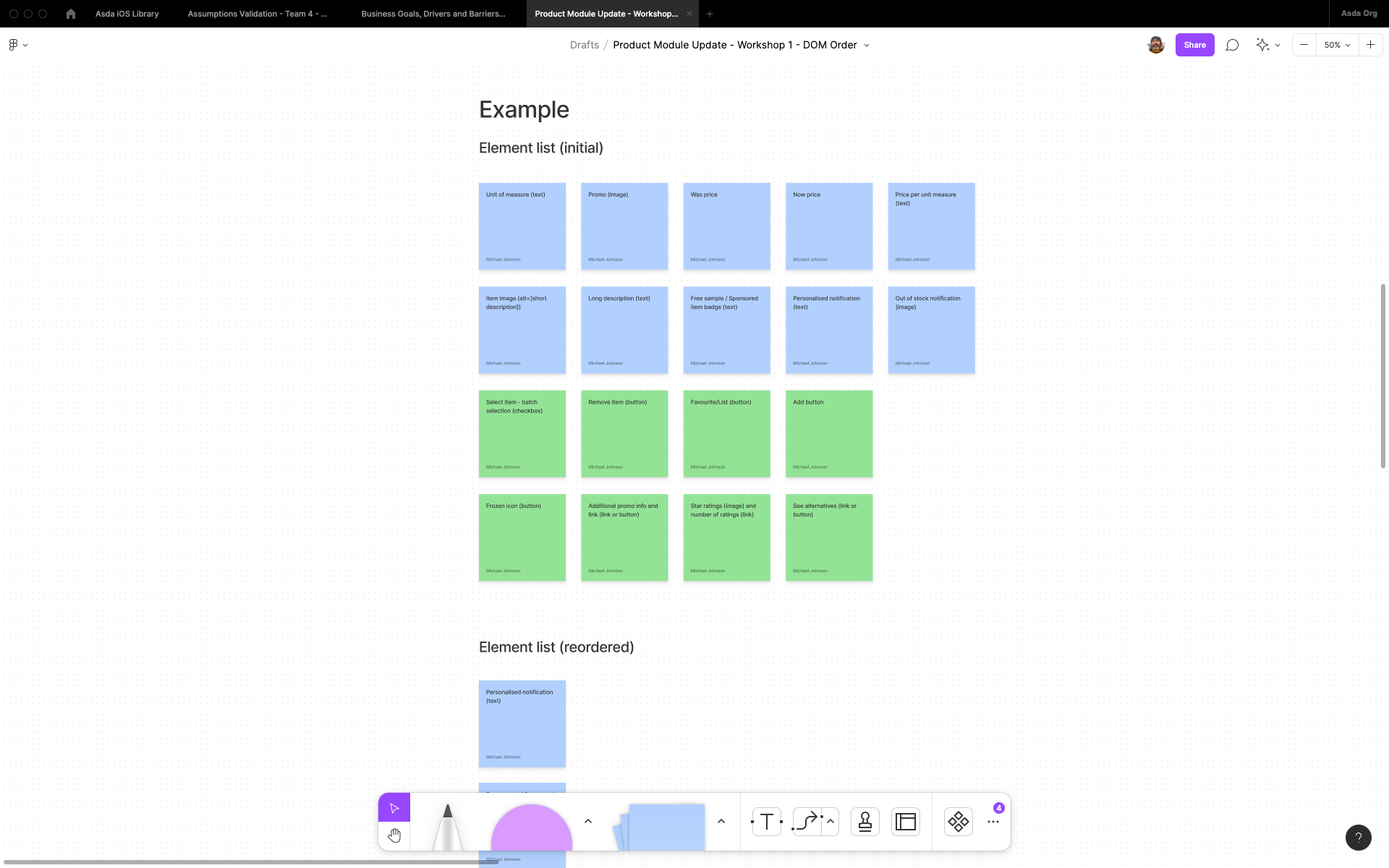
Workshop example in Figjam
The "verbal journey" (DOM order)
The "verbal journey" is a user journey flow, complete with screen reader announcements. Some elements (such as the Free Sample badge and the Sponsored badge) will never appear together on the same journey, so they can share the same real estate, but stay in the same order - this is known as the DOM order and the developers will use this to code properly.
Wireframe
I created a wireframe to show how the elements would work in portrait and landscape but keep the same DOM order.
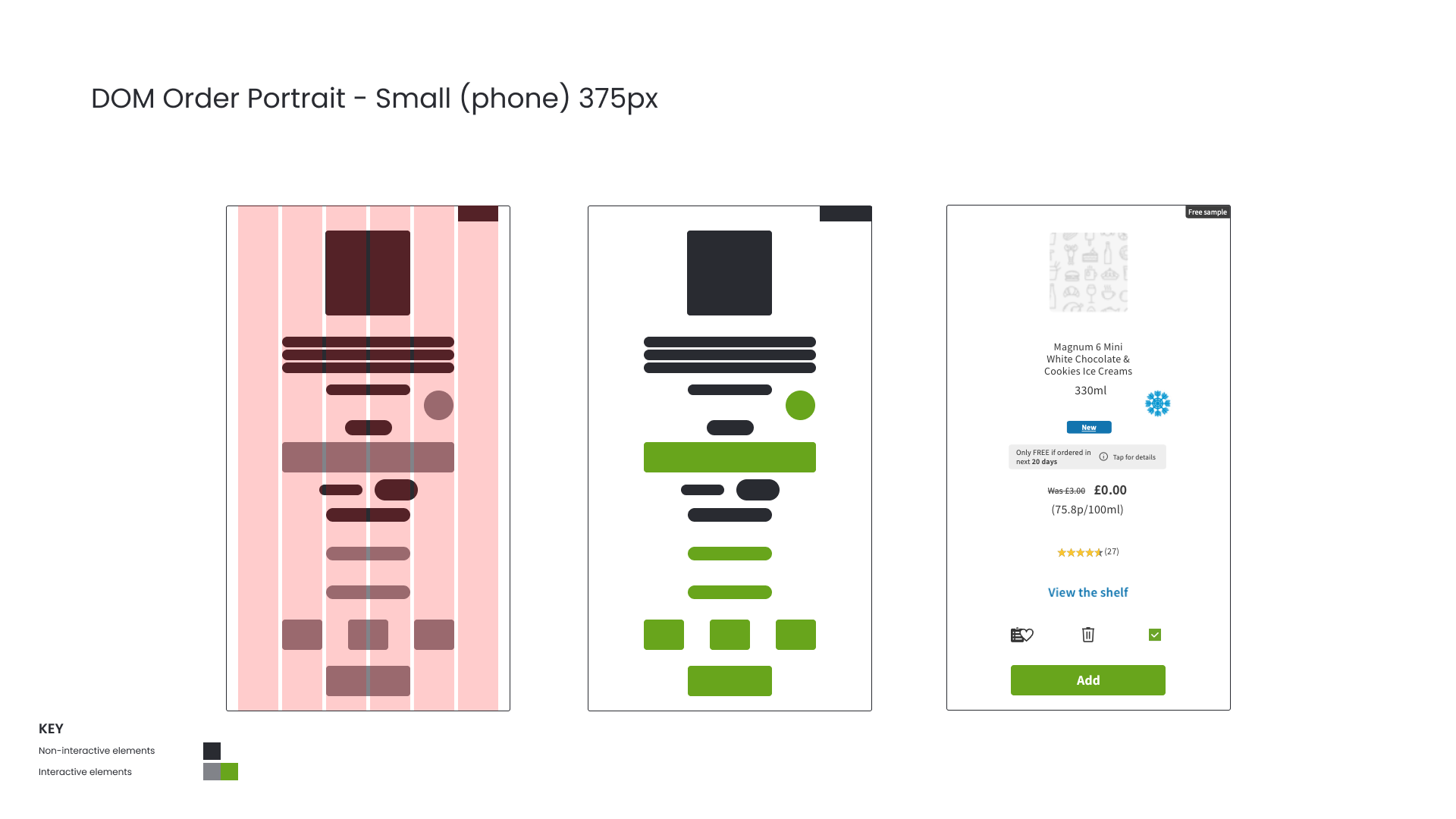
Design for portrait
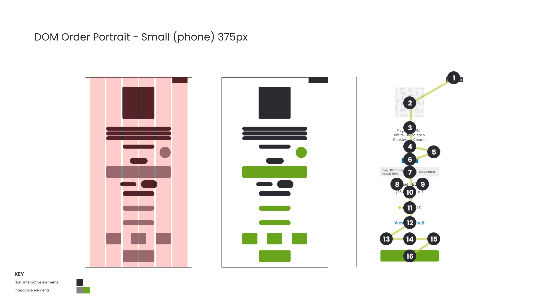
DOM order for portrait
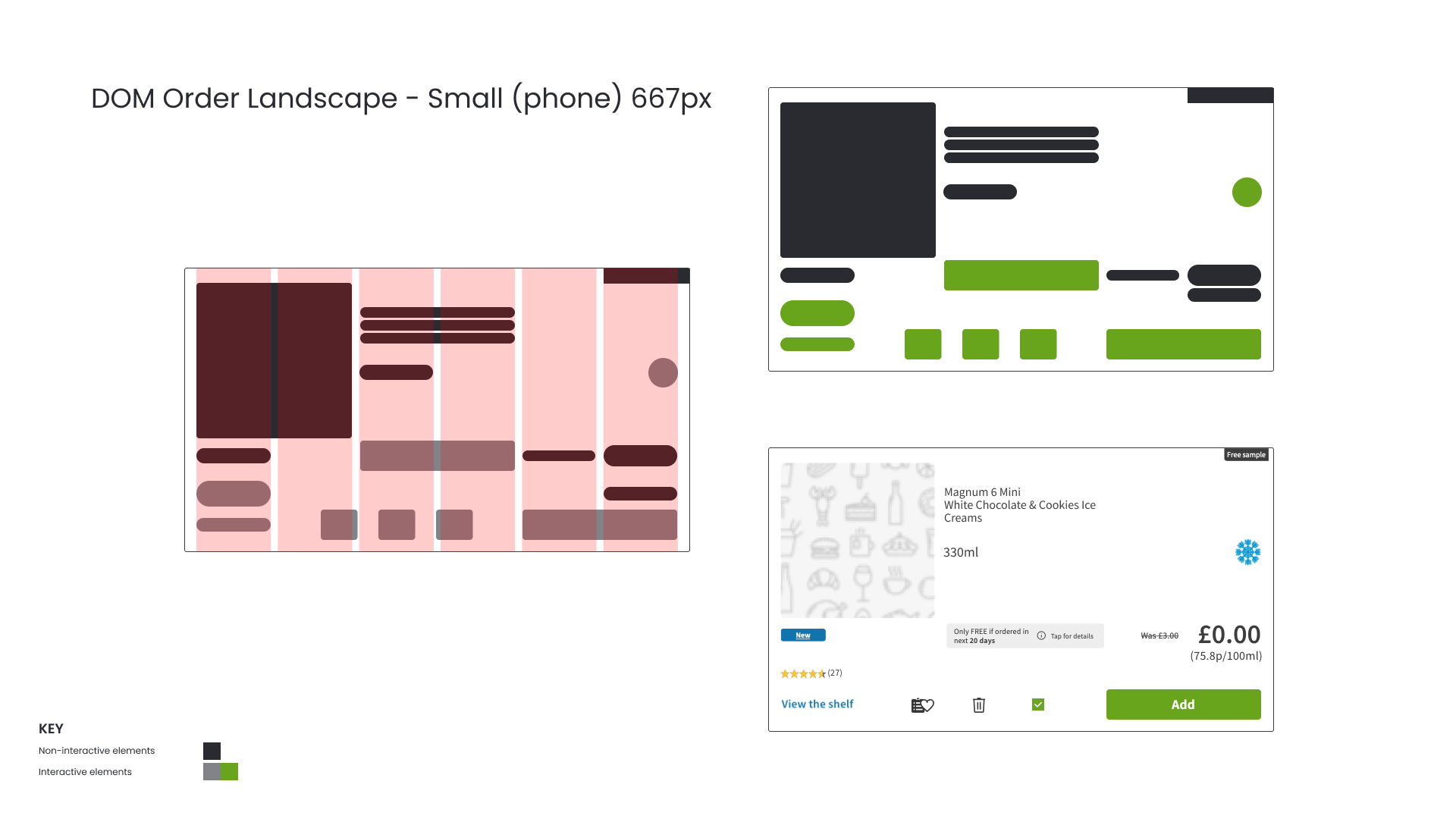
Design for landscape
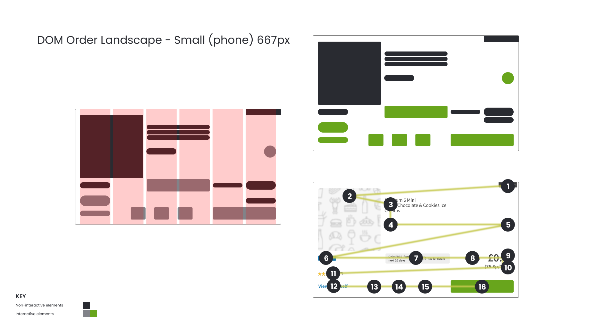
DOM order for landscape
Magnification and responsive design
Around 40% of iOS users scale text on their devices. For this reason any component should be able to be scaled by up to 200% with no loss of information or truncated text.
To do this I needed to ensure that there were no fixed height containers for elements and that when I designed to a grid, that no interactive elements (such as buttons) were wider than half the viewport to begin with, else when the user scales to 200% the element will break its container. Text containers in particular needed to be flexible because as dynamic type scales it should be able to force its container to expand vertically if it can't expand more horizontally.
I designed the new product module using six columns at 100% and three columns at 200% to show how the content would flow if the user were to scale it to 200%
Completed designs
The completed designs complemented one another and because they were responsive they could be adapted to be the same size as the originals if required. Most importantly, users could interact with them in a more logical way when using a keyboard or screen reader.
Additional considerations
While you can see from the comparison below that the new module works in the same size space as the old modules, there are still elements on it that need to be redesigned in order to improve accessibility and usability:
The contrast of the white text on the green button needs to be increased;
The text sizes in general need to be increased;
The contrast of the yellow stars on the white background needs to be increased;
The size of the touch targets for the interactive Favourite/Lists, Trash and Checkbox icons needs to be increased;
Any blue links such as "View the shelf" need to be underlined.
Next steps
It would be interesting to do some research into asking users to select which elements that they wish to appear on the product module and to order them. The hypothesis being that by not showing information that isn't needed the product modules (and the site/apps in general) will look cleaner, with more white space. The user journey may be better since the hierarchy of information will be personalised.