Overview
In my opinion, understanding and considering business requirements and facilitating better cross-team collaboration, in addition to being a good UX/UI designer, is what defines a senior designer.
For each of the projects below, I adopted the same approach.
A Lean/Agile Approach
Project plan and OKRs
For each project, I created a plan with the help of the Product manager, focusing on project OKRs which cited stakeholders, insights and outcomes.
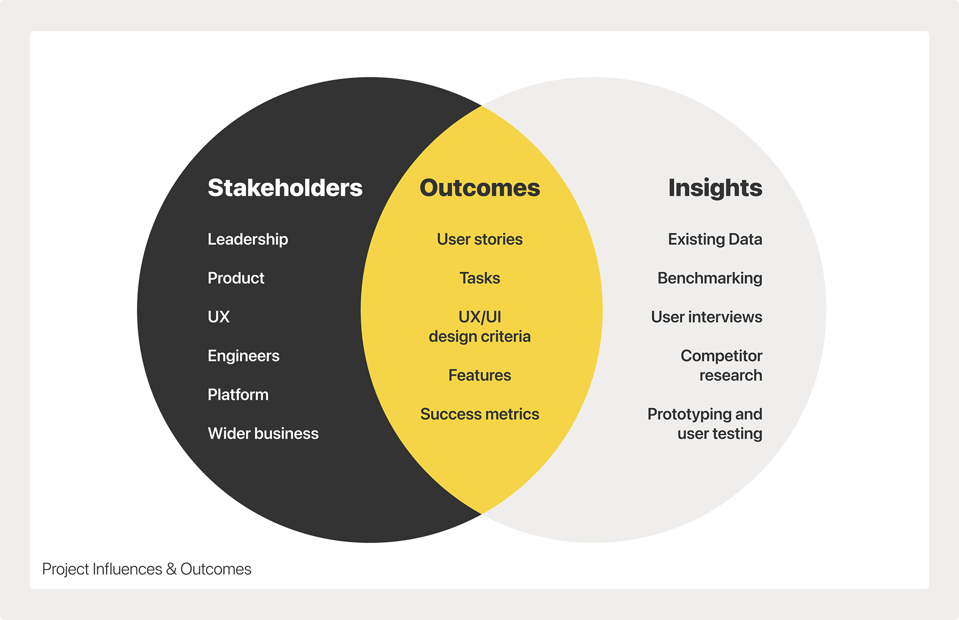
Project Influences & Outcomes
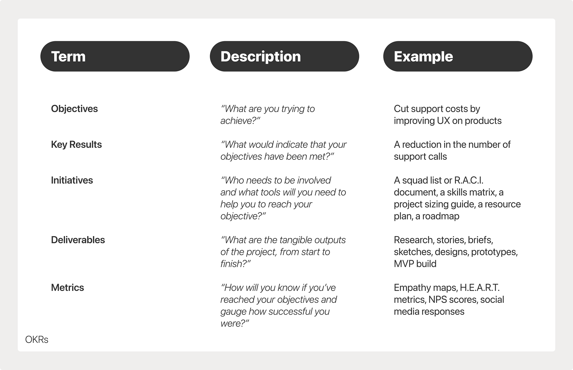
OKRs, Initiatives, Deliverables & Metrics
Early cross-team collaboration
Early cross-team collaboration was key to success, which required researchers, designers, product managers and engineers to all be involved in the discovery stage of the project.
Adopt a lean approach to projects
Using a template for each UX iteration we were able to establish quite easily how to manage a project and establish a concise problem statement.
We asked ourselves questions such as "What are we trying to achieve?", "What would indicate that our objectives have been met?" and "Has anyone attempted this before and if so, what happened?"
Lean project plan template which asks questions and inspires answers, to establish a problem statement and a risk-avoidance plan
Use Google's Design Sprint as a template
I used Google's Design Sprint as a template for the UX/UI design aspect of each project.
• Understand / Define
• Sketch
• Decide
• Prototype
• Validate
Illustration of Google's Design Sprint, a process which I adopted when improving designs
Work in an 'agile' manner
Often, engineers would begin development using pre-validated templates or UI patterns, so that they could go as far as possible and save time, before requiring more details on the design changes and annotations in order to proceed. Two week sprints usually gave us enough time to complete a design sprint, overcome any challenges and achieve our goals.
Peer reviews and quality testing
Engineering development work was peer-reviewed by several people, not necessarily from the product team, which could provide more unbiased testing and provide inspiration for future iterations.
Data analysis
The penultimate stage in every project was the analysis of data, using tools such as empathy maps. H.E.A.R.T metrics and NPS scores to draw comparisons between the control state and the updated state.
Retrospectives
The final stage in every project was a retrospective with the squad, to discuss how the project had been delivered, to congratulate people and celebrate successes and to learn from any mistakes.
Challenges
As a UX professional I fully understood the need for discovery and validation, but often resources were limited and so sometimes I needed to make a personal judgement as to how UX/UI changes might be received by users, rather than using user-testing for validation.
On occasion I would run workshops such as Crazy 8s with my colleagues, often with volunteers from outside of the Product team, to help get a fresh perspective on problems and to help steer my design thinking, rather than relying just on my own ideas or opinions.
FigJam file containing details of a Crazy 8s workshop for "Student Picker" project
Examples of UX/UI Improvements
During the short time that I was at Arbor Education, I was able to make some significant improvements to UX maturity by building a new design system and using the components of that to help make some UX/UI improvements during delivery of roadmap projects.
Below are some examples in a "Before & After" format, showcasing how the UX/UI of the key product was transformed from something outdated in appearance into something more contemporary and user-friendly.
Task Search
This feature had been built by an engineering lead and while it was a brilliant feature in terms of functionality, the UX/UI needed to be improved.
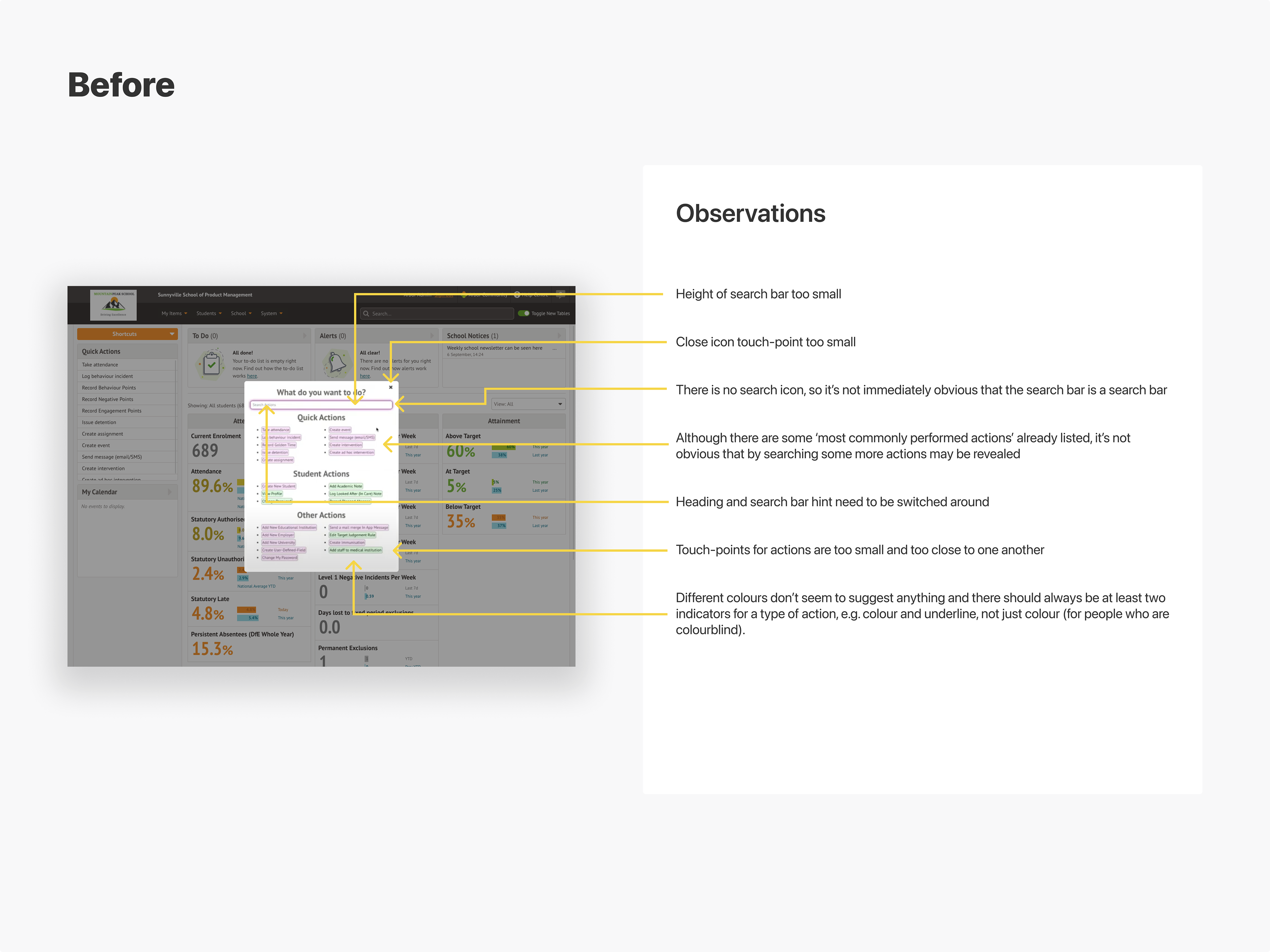
Task Search Feature | Observations
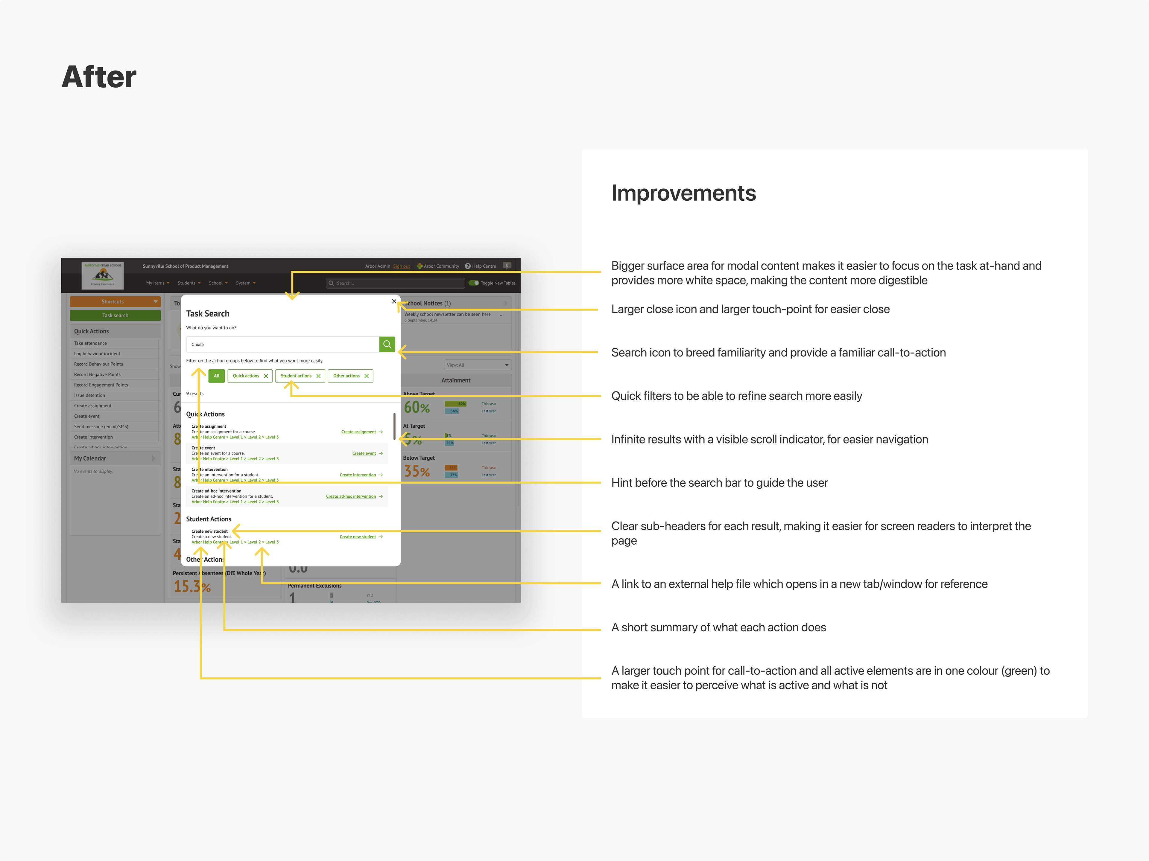
Task Search Feature | Improvements
Students Page
This page had been built by the engineering team many years previous and had been iterated upon with no UX considerations. The objective was to take the content of the page and create an inspiring, more contemporary UI which senior leadership could use as a 'North Star' guide as to how the Product team were planning to change the look and feel of the product to make it more attractive over time, hypothetically making it easier to use and more engaging.
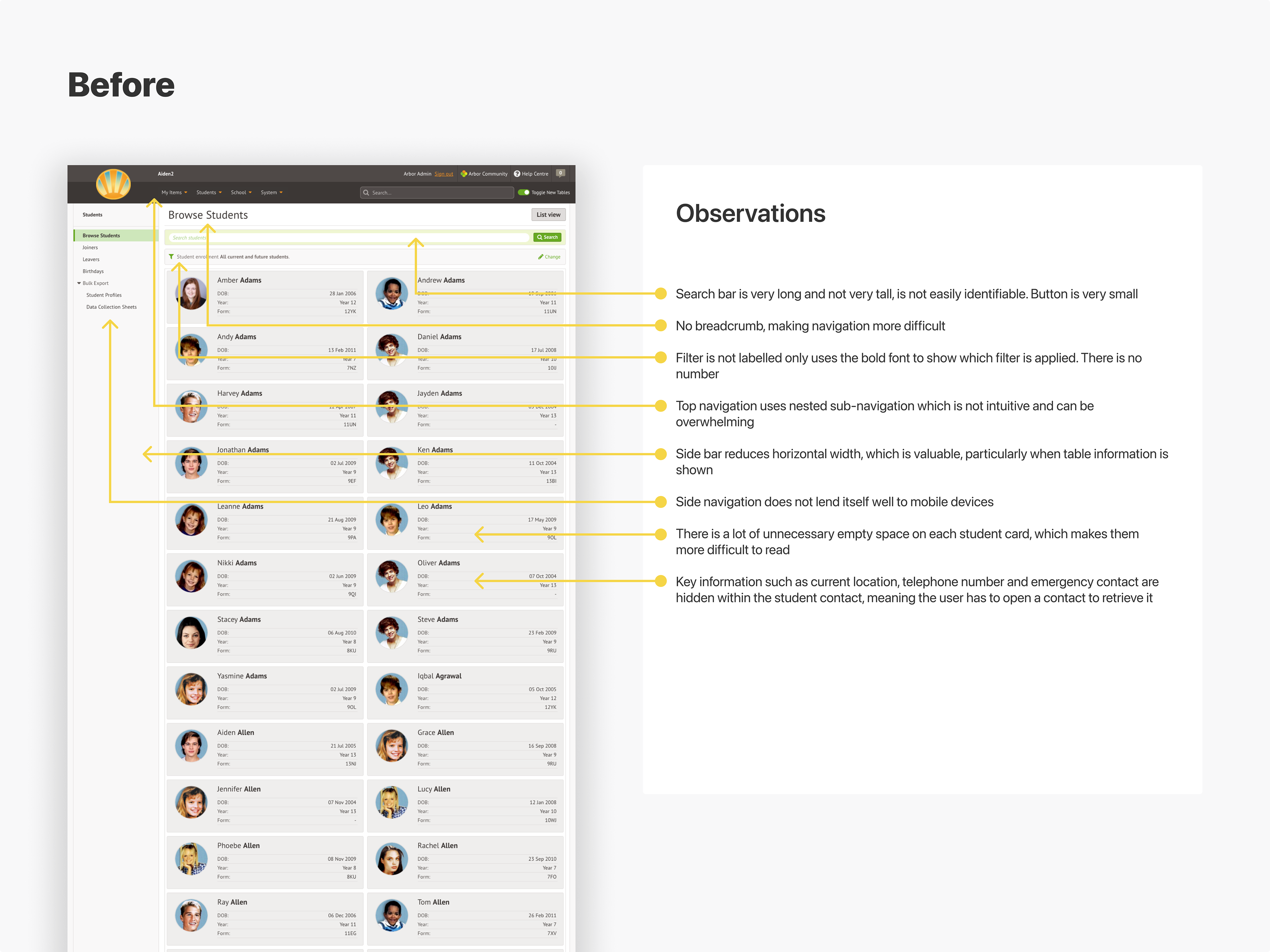
Student Page | Observations
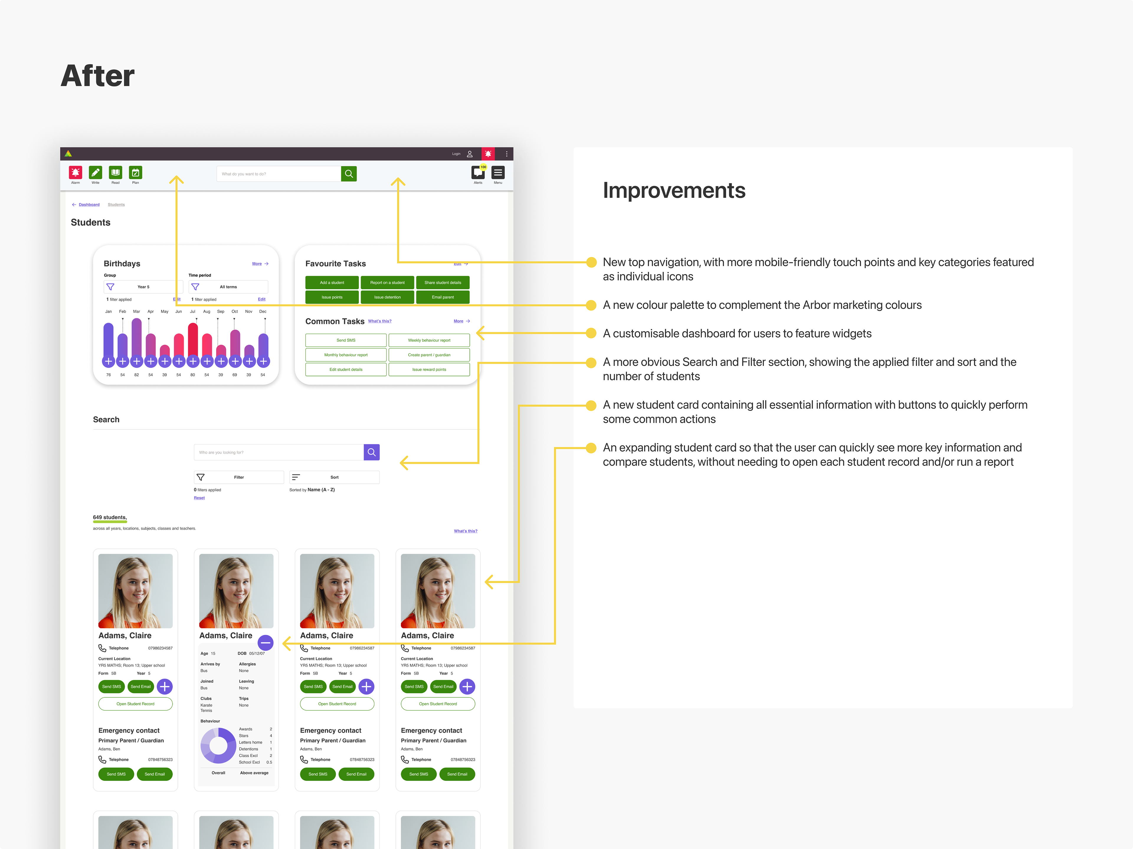
Student Page | Improvements
Student Profile Page
Using the same design style as the Students page above, I redesigned the Student Profile page to look and behave as if it were from the same suite of pages. As before, these were conceptual 'North Star' designs, intended to provide a sense of design vision for senior leadership.
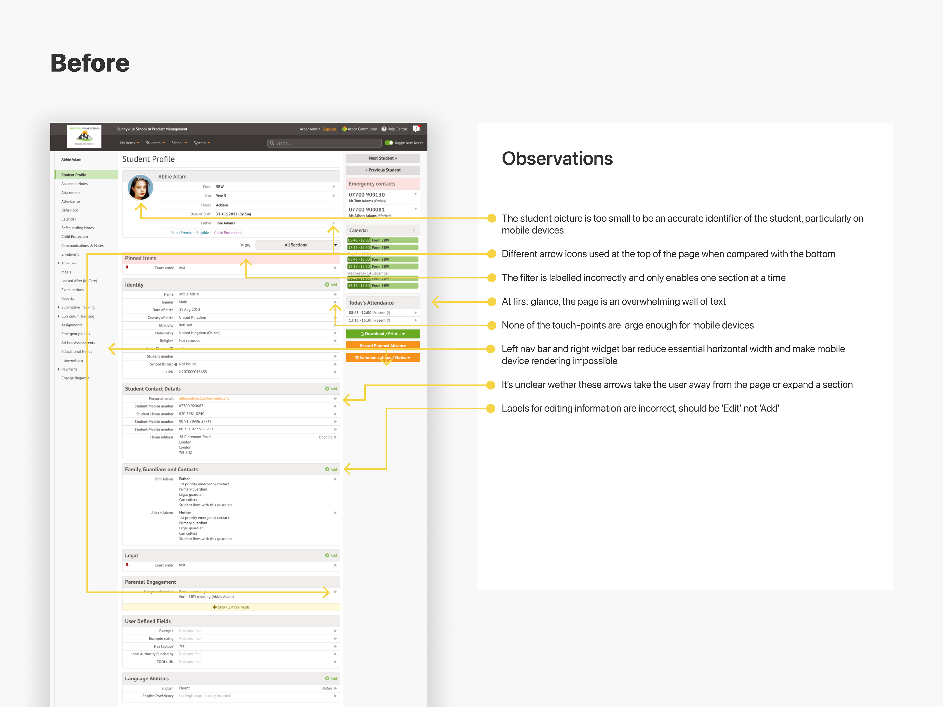
Student Profile Page | Observations
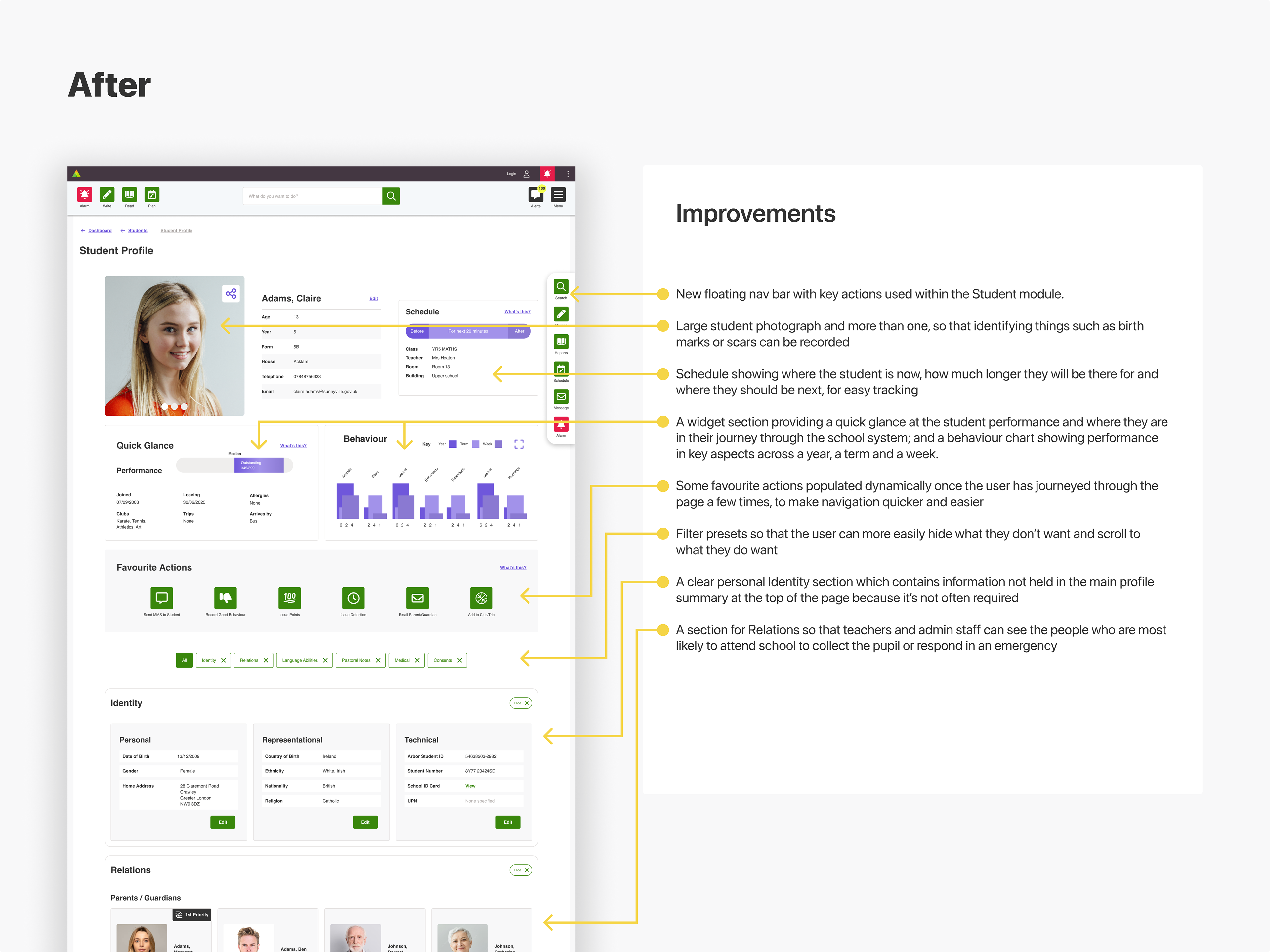
Student Profile Page | Improvements
Notifications Widget
The notifications widget was a feature that became active when the user clicked on the notifications icon in the top navigation. We decided that the UI needed to be refreshed but the functionality would remain the same. I produced 3 different designs - safe, adventurous and wild - so that stakeholders could get a sense of what it may look like.
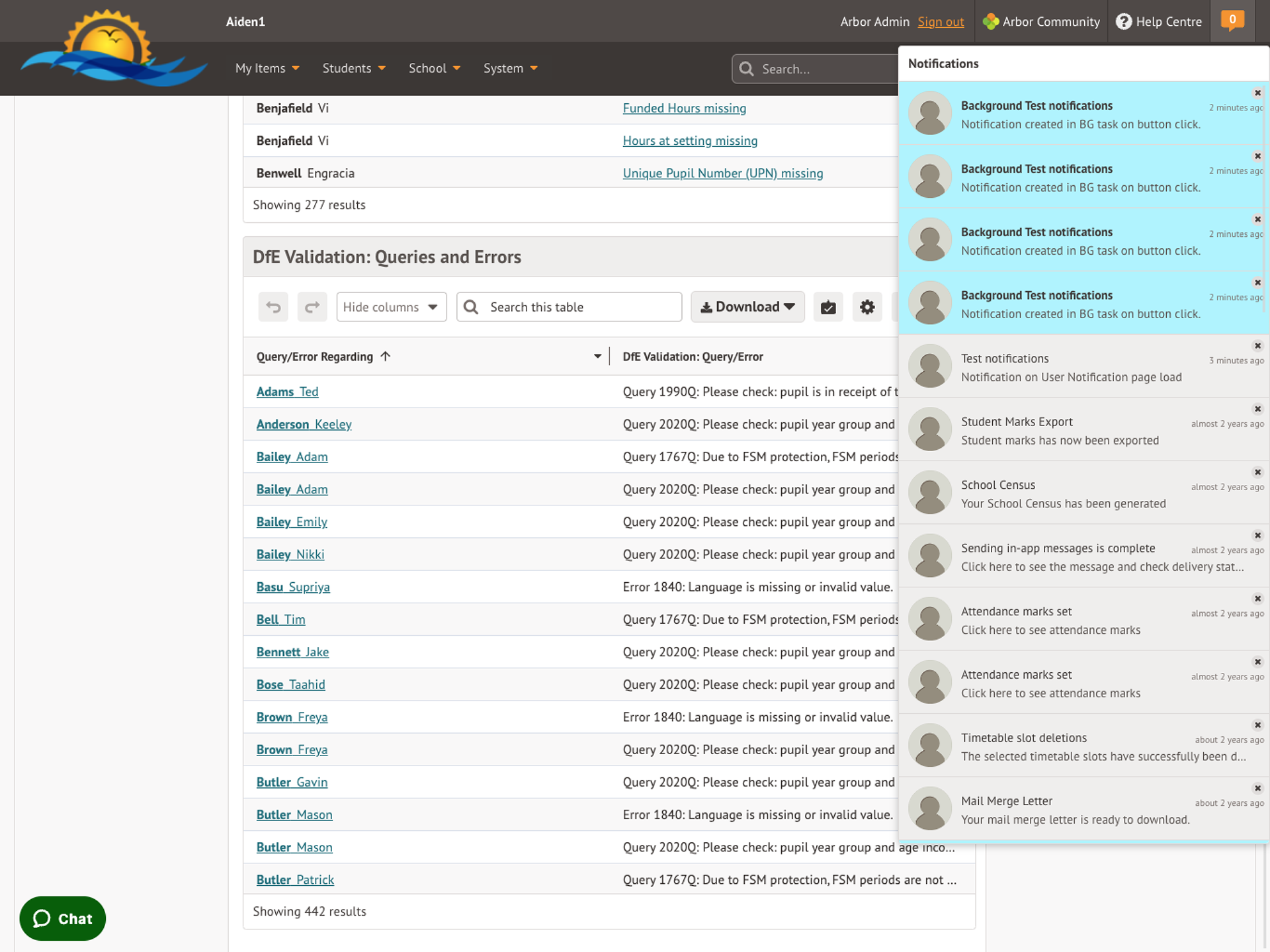
The original live version
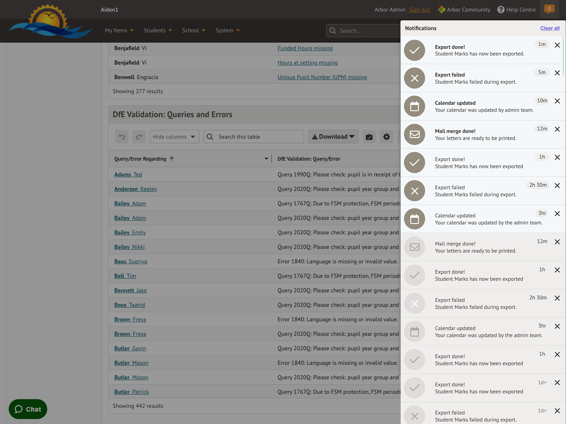
The 'safe' version
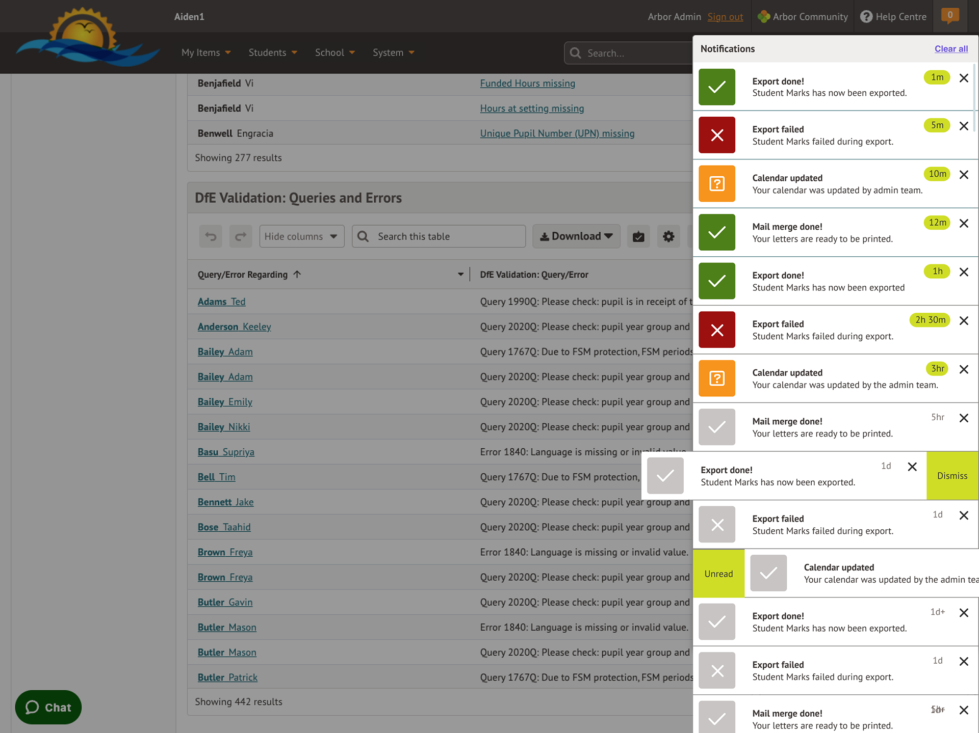
The 'adventurous' version
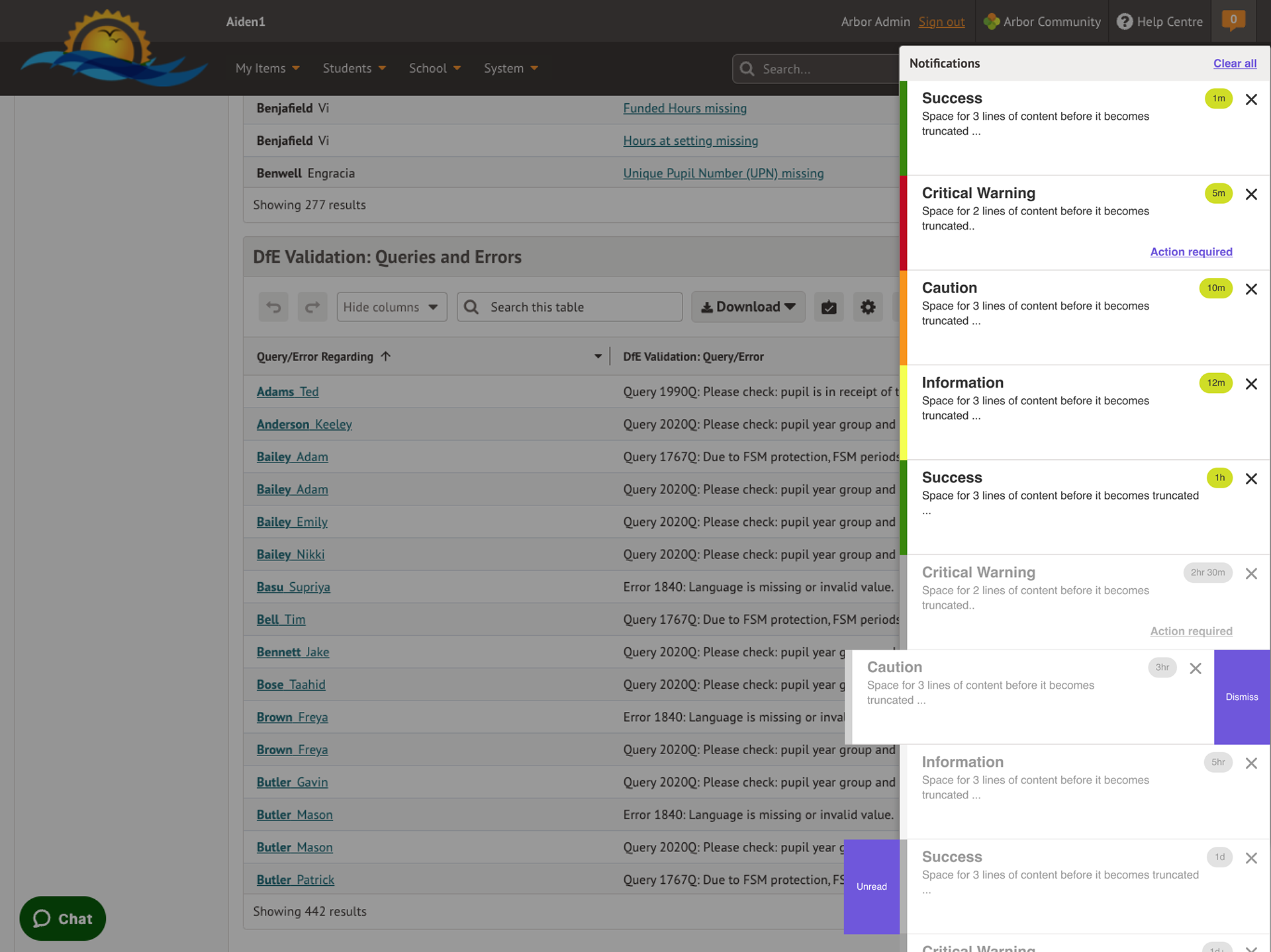
The 'wild' version
Key Results
In all of the examples above I applied lean and agile methodologies and used project management tools such as Kanban boards to deliver the projects. Each project was unique and yet each followed the same delivery structure. Sadly, I don't have any metrics to show for the success of each project since I was only at Arbor for a short time so all of the projects were still in the testing (validation) stages when I left.